Friday, July 17, 2015

Benefits of Master Copies

Practicing master copies has been extremely beneficial to developing my artistic voice.  Not only do these studies offer in-depth research into the effects of light, but they also clarify ways of portraying reality from the greatest masters of translating nature.  Each of these drawings, shown below, has fostered an awareness of aesthetic concerns that I am interested in.

After Ingres
After Bouguereau
Drawing of a sculpture from the Philadelphia Museum of Art
After a Carpeaux sculpture (quicker studies such as this and the one above offer a lot too)
Drawing Copy of a terracotta sculpture by Benedetto da Maiano
After Scott Waddell
     Furthermore, no matter how realistic each master's technique that I studied was, investigating the unique decisions they made revealed their representation of each subject's character and beauty.  Studying nature has been able to teach me much, but there is also great opportunity to discover what beauty is and the choices needed to be made to portray it and each subject's character by studying from the masters.

Studying the Color of Skin and its representation

The color of flesh that one perceives is caused by multiple processes of light reflection.  Diffuse reflection, specular reflection and subsurface scattering contribute to the perceived color of skin.  Through studying how light's interaction affects the color of skin I was able to use that information as a basis to paint skin.

Diffuse reflection occurs when light rays projected from a light source reflect at various angles from its meeting with the surface of a form.
The example above shows only a fraction of the portion of light rays emitted from a light source.  In diffuse reflection, millions of light rays, composed of photons, are projected from the light source to meet the surface of a form and then reflect at various angles.  The diffusely reflected light rays enter the eye at varying levels of brightness to create an image of a form under a light source(s).  This causes the form to appear darker as its surface turns away from the light.

Specular reflection is the mirror-like reflection of light on a smooth glossy surface where the angle of incoming light projected in a single direction from the light source, the angle of incidence, is reflected at the same angle into a viewer's eye, the angle of reflection.  Therefore, the angle of incidence equals the angle of reflection. Specular reflection is only visible on a form at the halfway point between the angle of incidence and the angle of reflection into a viewer's eye.  Many specular reflections create a highlight area.

Subsurface scattering is a process of light reflection where light penetrates the surface of a translucent object and is scattered by interacting with the material before it exits the object from a different point than it entered from.


Diffuse Reflection (light ray does not penetrate the surface),  Subsurface Scattering (light ray penetrates the surface)

On human skin this interaction of subsurface scattering allows for the reflection of the sub-dermis hue (the color of flesh and blood) in its combination with the epidermis hue.  While subsurface scattering occurs at various levels of light intensity, this effect is heightened in the presences of a great deal of light.  A hand placed over a flash light emphasizes the effect of subsurface scattering. 
The light penetrates through the outer layer of skin to interact with the reddish color of the sub-dermis before the light exits the surface, in this case on the other side of the light. (4)  Because the epidermis (outer layer of skin) is translucent it can be thought of as a veil through which we can see some of the layer underneath it.

Human skin is made up of many layers and each has its own properties.  The epidermis is the outer layer of skin and primarily exhibits diffuse and specular reflection.  Lights interaction with the sub-dermis of skin (flesh and blood) primarily results in subsurface scattering.  Blood is partially made up of red blood cells, composed of hemoglobin, and its properties contribute to the reddish hue perceived in the color of skin.

Human red blood cells magnified 1000 times (2)
 When light interacts with skin some light rays are absorbed or reflected from the color of the epidermis while some light rays penetrate through the epidermis and interact with the color of the sub-dermis to be absorbed or involved in subsurface scattering before exiting the surface.  Some light rays penetrate even further to reach the bone layer.(1)

All of these interactions that light has with skin creates a specific effect on the perceived color of skin.  Due to the multi-layered process that creates the color of skin, I attempted using a layered painting process to try to represent the color of skin and the effects of light that make it visible.  I experimented with this process on a painting of  an ear and will use that painting to illustrate the thought process that I have been following.

Applying  Light Concepts to Painting

The interaction of light with a painted surface involves diffuse reflection and subsurface scattering as well.  Some light rays interact with the opaque layer of paint on the surface while some light rays continue to penetrate the surface to the color under-layer and then to the color of the canvas before light is reflected from the surface of a painting, producing a combined effect of each layers color.(3)


With these properties of light's interaction with paint in mind, I experimented with representing the color of skin through its light effects in my painting.


I began by making my under-layer reddish in hue to represent the sub-dermis layer of skin.  This layer was painted thinly to allow for light to pass through it before reflecting from the canvas layer.

Then I more opaquely painted the color of the form as I perceived it.  Due to the opacity of the painted layer, it was able to reflect light more diffusely (representing diffuse reflection in the epidermis of skin), while still allowing for light to pass through it to also reflect the more reddish hue of the under-layer (representing subsurface scattering in the sub-dermis of skin).  And the color of the canvas in combination with the amount of light passing through its surface contributed to the luminosity of the color that is ultimately reflected from the painting as light rays exit the surface with properties of the layers that it has interacted with.  This painting seemed to have more of a glow than my other pieces where I used a different process.


3-D Modeling Layers

This painting process was largely inspired by investigations into 3-D modeling.  Many 3-D modeling programs separate the effects of subsurface scattering, diffuse reflection and specular reflection into different layers before representing their combined effect.  The consideration of each specific effect of light contributes to stunning representations of human skin.
Image from David Moratilla

3-D modeled image from David Moratilla

Image with no subsurface scattering on the left, compared to being shown with subsurface scattering on the right
 (5)

While the painting process described in this post is just an experiment, I am not sure how effective it has been at representing the color of skin, especially in the photograph shown, but these investigations are something for me to continue experimenting with or at least thinking about in the future.  There are many other factors that could be considered to specify the effect of the process, including the specific amount of blood in a given area, the properties of melanin in a given area, the density of hair on skin etc., and each factor could alter the painting process to produce more specific results.  So I look forward to continuing investigations with painting skin.

References

- (1) Blevins, N. (2006, June 12). Translucency and Sub-Surface Scattering. Retrieved July 15, 2015, from http://www.neilblevins.com/cg_education/translucency/translucency.htm

-(2) https://commons.wikimedia.org/wiki/File:Humanrbc1000x.jpg

- (3) Gamblin, R. (2003, October 1). Why Classical and Contemporary Paintings Look So Different? Retrieved July 15, 2015, from http://www.gamblincolors.com/newsletters/studionotes12.html

- (4) https://en.wikipedia.org/wiki/Subsurface_scattering#/media/File:Skin_Subsurface_Scattering.jpg

-(5) http://www.gamedev.net/topic/585052-real-time-skin-shader/

Many of these concepts of light are explained in further detail on Doug Flynt's blog and in Scott Wadell's video webisode here.

Wednesday, July 15, 2015

Canvas Preparation

I used a certain process to prepare the surface of the canvas for a commissioned portrait painting that I am currently working on.  The dimensions of this painting are life-size so I had to stretch a large  canvas.  I used an unprimed Utrecht medium texture cotton canvas for this surface. 


To prevent the stretcher bars from bending as pressure would later be applied from stretching and preparing the surface of the canvas I used cross bars (that I used from a store bought canvas that I previously had).  These cross bars were either nailed or screwed into the frame of the stretcher bars.


After the canvas was stretched I applied a layer of acrylic gesso, using the Golden brand of gesso.  This layer was applied by laying the gesso on the canvas with a brush and then using a roller, in a perpendicular direction to the brush strokes, to flatten out the texture of the surface.
     The surface was then sanded with a 220 grit sandpaper and the process was repeated twice. Once much of the space between the strands of fabric on the canvas were filled in with gesso from using the roller, I used a process to make the surface much smoother.


I first applied a large viscous amount of gesso to the surface using a brush.  Then I quickly used a plastic taping knife, shown below, to drag the wet gesso across the surface while trying to hover over touching the previously dried layer of the canvas in an effort to create a smooth surface.

This process of using a plastic taping knife is somewhat similar to laying down an area of concrete.

Once the surface had been flattened with the plastic taping knife, I proceeded to sand the dents and irregularities and out of the surface with a 320 grit sandpaper.  This part of the process took a very long time.  Part of the cause of this was that the plastic taping knife that I used did not have rounded edges for the corners of the tool, which I prefer to use.  The sharp edge of the tool that I used caused it to dig into the wet gesso as it was dragged across the wet surface.  I repeated the process with the plastic taping knife and sandpaper twice to smooth the surface for painting.

A small part of the surface shown on the left, next to the unprimed texture of canvas shown on the right.

Then I transferred the drawing to the surface using an oil transfer method (Doug Flynt explains this process on his blog here).  The process of surface preparation that I used created a much smoother surface to paint on than the texture of the canvas that I started with and was much cheaper than using a large amount of expensive linen.

Friday, July 10, 2015

Thank You!

Thank you so much to everyone who has generously supported The Arthur Haywood Education Initiative through donations and thanks to the kind support of those who have shown encouragement of this project on social media and elsewhere.  I am sincerely grateful for this gracious support that has allowed The Arthur Haywood Education Initiative to reach its funding goal for art supplies!  This support will allow me to significantly enhance my art during my first year of study at the Grand Central Atelier.  

I am sincerely grateful for those who have been extremely generous to donate towards funds for art supplies.  These supporters include, Daniel WK Chow, Kate Williams, Julie Haywood, Lilah Galdi, Andy Heimann and Keanu Baxter .

I have recently purchased many of the art supplies by adding the funds to a Blick gift card and will be using the gift card to purchase a few more supplies (a few more pieces of Artistico Fabriano paper) during the school year.

Updates on artwork that I will be making with the art supplies from my studies at the Grand Central Atelier will be posted on this blog in December 2015 and May 2016.

Thank you so much! 
To view the Arthur Haywood Education Initiative kickstarter page, please click here.

Tuesday, June 30, 2015

The Arthur Haywood Education Initiative


 In September of 2015, I am honored to begin studying full-time at the Grand Central Atelier to gain technical skills that are vital to conveying my visual expressions to their full potential.  To assist in my development,  I have started a project called The Arthur Haywood Education Initiative.
Please view the video above for more information.  For further information and to support by July 24th please visit: my kickstarter page.

I also have prints available until July 24th.  The proceeds will benefit the funding for art supplies during my first year of study at the Grand Central Atelier.  For further information and to support please visit my kickstarter page.
Thank you!

Sunday, June 21, 2015

THANK YOU!


 Thank you so much to everyone that was able to visit my art show and the kind people who have supported my work through the purchase of some of my pieces. I am sincerely grateful for all of the encouragement and support that I have received for my art work.

I was glad to meet so many great people at the reception. The show will be on display at the Philadelphia Sketch Club for one more week, so thanks in advance in case anyone may be able to view the show during that time.  For more information, please visit www.ahaywoodfineart.com/p/study-to-synthes.html


Monday, June 1, 2015

"Study to Synthesis" Exhibition Currently on Display

My exhibition "Study to Synthesis" will be on display from June 3rd -30th, 2015 at
The Philadelphia Sketch Club, located at 235 S. Camac Street, Center City, Philadelphia, PA 19107.
Admission is Free and Open to the Public.  
Gallery hours are Wed, Fri, Sat, Sun from 1 - 5 PM.
Reception:  June 21st, 2 - 4 PM

Below are a few images from the exhibition.  To preview the works from the exhibition please visit the show's Online Gallery. 


Saturday, May 2, 2015

Upcoming Exhibition


It is a special honor that I will have a group of my drawings and paintings on display at The Philadelphia Sketch Club this June.

The exhibition "Study to Synthesis" focuses on classical studies that have significantly informed the depictions of aspiration in the narrative portraits on display.  Each of these studies was created with the intent to develop technical skill in representing the particular character of each subject in a believable way.  The understanding gained from these studies has manifested in the creation of narrative portraits whose emotional qualities gain significance from countless hours of investigating the expressive reality of nature.

The exhibition can be previewed on the show's Online Gallery

Inquries are welcome.  Please contact ahaywoodfineart@gmail.com
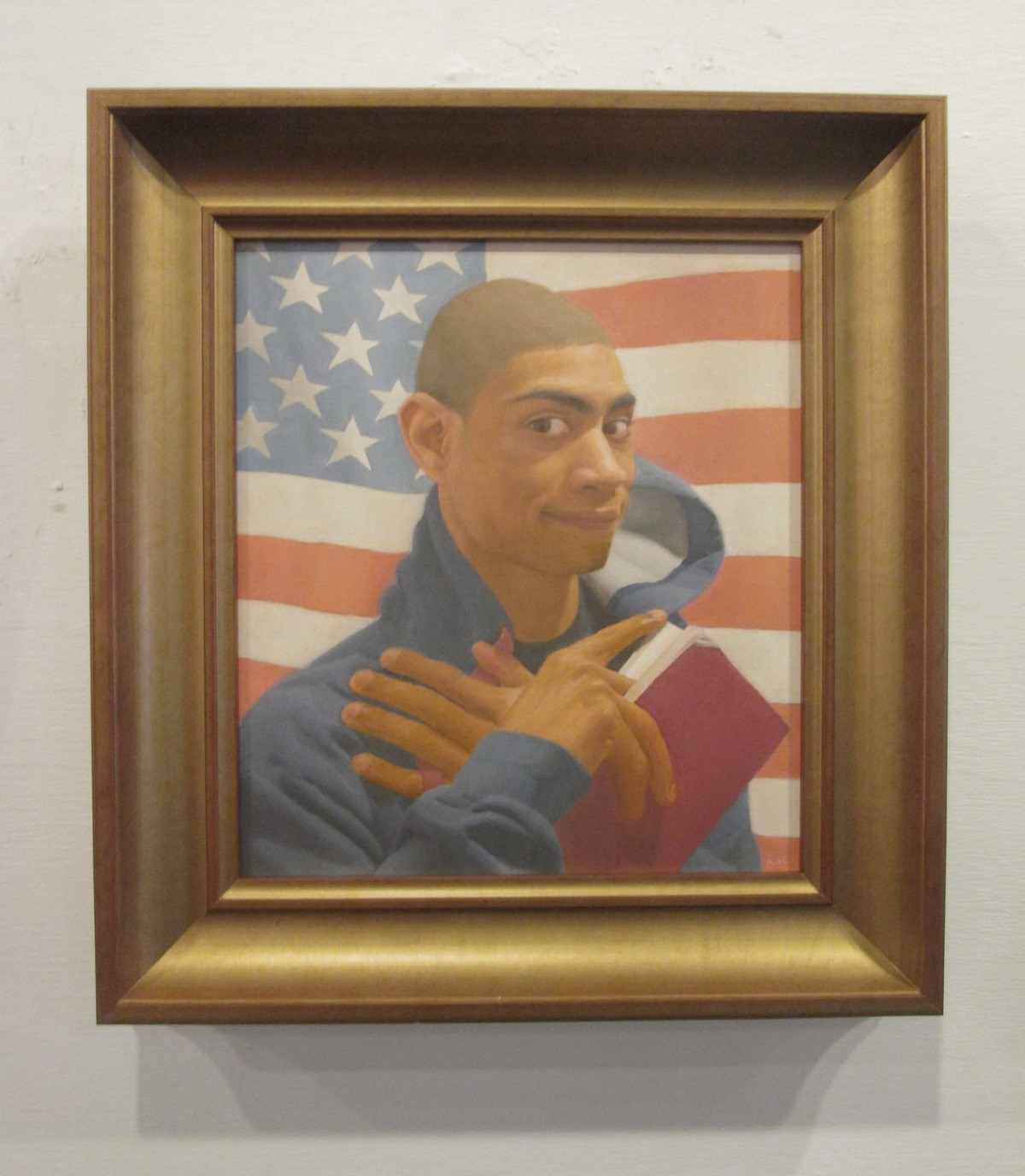
Sunday, March 29, 2015

Drawing on Toned Paper

"Inspiration" Graphite, White Charcoal and Watercolor on paper

While working on my drawing "Inspiration" I utilized a process that helped for modeling on toned paper.

This sphere study that I made before starting my drawing shows how I went about using my materials while modeling. 

 I used the tone of the paper to represent the similar value of a plane on the sphere turned away from the light source.  All areas on the form that turned down from that plane became darker in value, while all areas that turned up (towards the light source) from that plane became lighter in value. Essentially for my portrait drawing, any part of the portrait that was darker than the tone of the paper became darker with graphite and any part of the portrait that was lighter than the tone of the paper became lighter with white charcoal.  

Scott Waddell wrote a very helpful article about modeling on toned paper, which can be purchased at ArtistsNetwork.com and Anthony Ryder has some very helpful advice for drawing on toned paper in his book, The Artist's Complete Guide to Figure Drawing.

Also, I used photographic references for this drawing and found it useful to take many images of the portrait from various angles to help with a three-dimensional understanding of the form while working from the photographs.  


Wednesday, March 25, 2015

Some Art History Investigations


This is a very large image and the full-size image of this timeline can be viewed here to be examined.


Out of curiosity in how many of the traditional figurative painters of the past were connected to 21st century traditional artists through the exchange of techniques and information, I did some research and made the bulk of this illustrated timeline in 2012. Although a lot of artists are mentioned in this timeline, there are many great and notable artists that I was not able to include in this timeline.  (For no reason other than that my research and time was limited). This timeline investigation extends to the early 21st century with some notable artists who have taught many other notable 21st century artists who are currently exchanging valuable techniques and information to others in-person and digitally in this contemporary age.

To name a few of those artists, Jacob Collins (founder of the Grand Central Atelier), Anthony Ryder (founder of the Ryder Studio School) , Nicole Michelle Tully and Tim Stotz (founders of Studio Escalier ) were some of the students of Ted Seth Jacobs.  Michael John Angel (founder of Angel Academy of Art) was a student of Pietro Annigoni.  Daniel Graves (founder of the Florence Academy of Art) was a student of Richard Lack and also associated with Pietro Annigoni.  Nelson Shanks (founder of Studio Incamminati) was a student of Pietro Annigoni and John Koch.  Graydon Parrish was a student of Michael Aviano.  There are many other notable artists that I was not able to include in this list (for no other reason than that my research and time was limited).

I am presenting this art history timeline investigation to possibly receive information on how Squarcione, Verrocchio and Giotto may be connected.  My resources for this timeline consisted of museum websites, artist biographies, Wikipedia and the Art Renewal Center website.   If there are any art historians or people familiar with art history that would be willing to respond to my inquiries it would be very helpful. Thanks.

Another useful art history reference to look at is Tim Stotz's Flowering Staircase Diagram.

Sunday, March 8, 2015

Painting Video Clips


I was working on a painting video that shows the process I was using while working on my painting, titled "I will be brave" (shown above).  This post shows a few clips and information that I was editing for the video.  I did not include audio into these clips but descriptions of the clips are in this post. (Please excuse the shakiness of the footage.  The setup of space between me, my easel and mirror did not allow room for me to set up a tripod to stabilize the footage, so I had to hold the camera with my left hand while I was painting.)

Color Mixing
I approached color mixing by adjusting a color's hue, value and chroma.

Hue -  Includes colors that range from yellow, red, purple, blue and green.
Source: Wikipedia

Value- Lightness or darkness of a color.
Source: Wikipedia

Chroma - Intensity of a color from neutral to most intense.
Source: Wikipedia

Below is a video that displays color mixing.


I was aiming for a yellow-red hue that was light in value and high in chroma.  My palette consisted of Titanium White, Cadmium Yellow, Yellow Ochre, Cadmium Orange, Cadmium Red, Burnt Sienna, Alizarin Crimson, Raw Umber and a few neutral values (from white to black).

So I started mixing with the yellow-red hue of Cadmium Orange and adjusted the Hue a bit more yellow with a color that was more yellow, Cadmium Yellow.  Once the hue was established, I adjusted the Value with a much lighter color, Titanium White.  Once the hue and value were established, I adjusted the Chroma (Intensity) of the mixture.  I was aiming for a color that was higher in chroma than my mixture so I added colors that were higher in chroma (and yellow-red in hue), Cadmium Yellow and Cadmium Orange.
     For the next mixture I reduced the chroma with a color that was less chromatic than my mixture, Raw Umber.  This caused the mixture to reduce too much in chroma so I added some Cadmium Orange and Cadmium Yellow to raise the chroma.  

More information about color mixing can be found on Gamblin's Website.  I relate to his term of "cool colors" as colors that are low in chroma (intensity).

Modeling In Strips

I made a short demonstration of the modeling process that I used on an imaginary strip.


After initially placing 3 large planes on my strip I added a few smaller planes to bend them into each other.  This process of bending larger planes into smaller planes is known as subdivision.  I continued to bend the form, although I was adjusting much smaller planes, by more subtlety turning those planes into each other.  As the form turned toward the light I pushed it lighter in value and more chromatic in color.  As the form turned away from the light I pushed it darker in value and less chromatic in color.   This process continued as I refined the strip by sculpting the structure of its form with value and color.

I was striving to create a gradation that described the curvature of form. While it can be difficult to perceive the subtle differences in the gradation at a glance, isolating the gradation into a strip made it easier to notice the subtle changes in value and color that describe the form's structure.

Below is a video of me using the process of modeling from planes to refining on the forehead in my painting.


The direction of the strip was determined by the direction of the form's most curvature from the light, meaning the most change from light to dark on the form.  I added another strip below that strip to paint the entire form of the forehead and continued painting the portrait one form at a time.


Considering Terminator Edges

In the video clip I spent some time trying to refine the clarity of the terminator edge (shadow edge) on the forehead before making adjustments to the curve of form.

Although the gradations leading into the terminator edge is much more subtle for the sphere on the right, upon closer inspection the clarity of the terminator edge itself (not in comparison to the gradation leading into it) is similar to the terminator edge for the sphere on the left.

I found consideration of the terminator edge useful because, since the terminator is the hardest edge on the form, its clarity can set a standard for the level of resolution for the form.  Even though the gradation leading into the terminator edge on the forehead was subtle, I tried to consider the clarity of the terminator edge on that form and all of the forms in the painting.