Monday, January 7, 2019

Process from a Library Mural Design

Click Images to View larger
"The Wonder of Reading"
Mock Design for the Parkway Central Library
1901 Vine St, Philadelphia, PA 

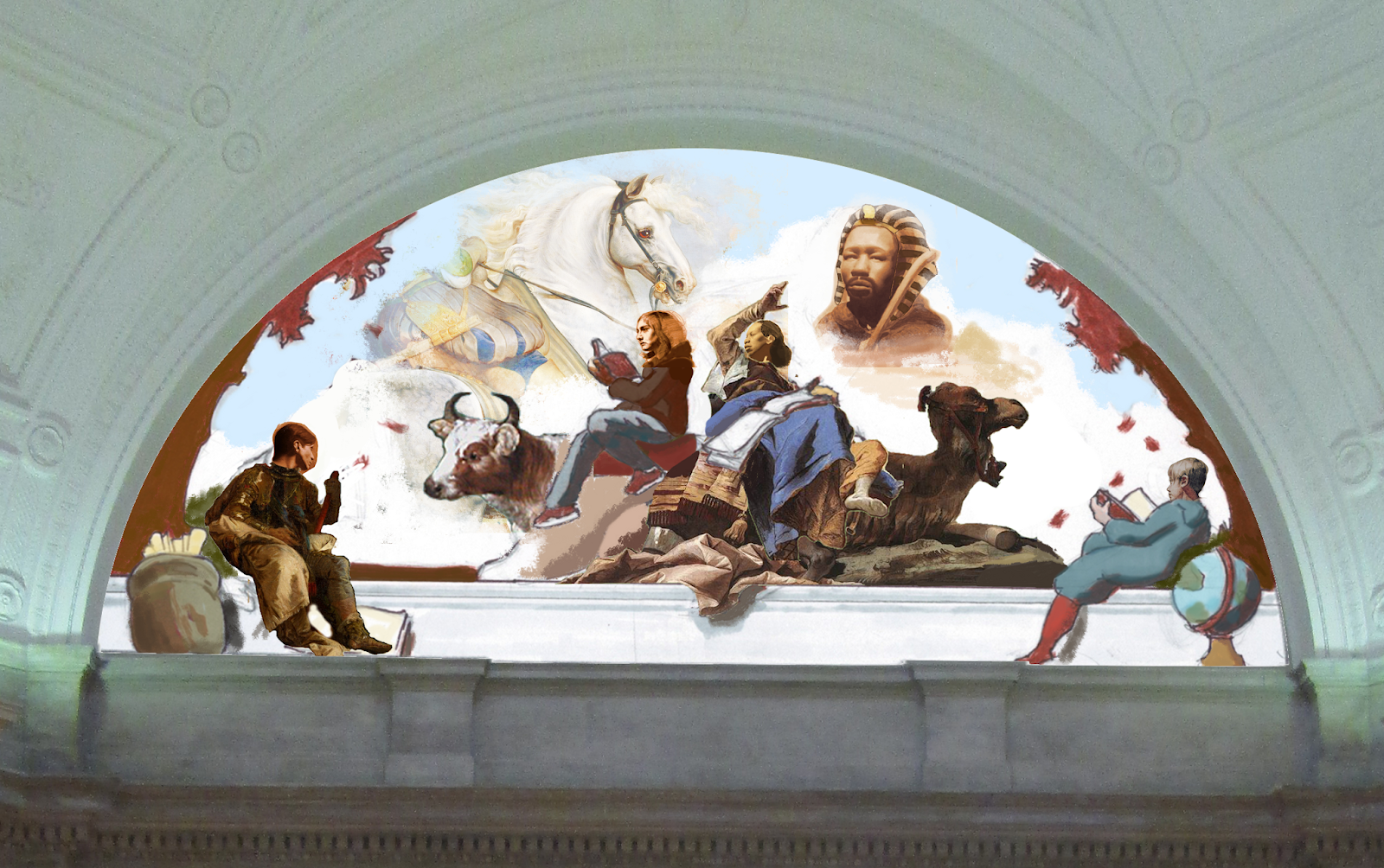
This design developed as student assignment in Philadelphia's Mural Art's Mural Training Program. My work celebrates academic achievements and aspirations of diverse people. This mural design was an opportunity to explore expanding my work to a public context.  My design for the wall above the entrance stairway in the Parkway Central Library is composed to visualize how reading can bring stories to life. As the people read, characters appear in the clouds of their imagination.  A galloping stallion in front of the Colosseum transitions into an ancient pharaoh.
 
 I chose this space because as a free library it is an accessible place for learning. The Parkway Central Library offers reading resources that are essential to broadening one’s awareness and in creating opportunities for people. The architecture of the round lunette in this staircase presented an opportunity to suggest the illusion of another world behind the horizontal cornice. This illusion intends to create a sense that a world where learning is vastly captivating exists within the library.

This image was created through digitally compiling drawings and paintings that I made from life. The Colosseum was referenced from Hubert Robert’s ​Colosseum ​ and the trees were referenced from William Bouguereau’s Rest.  This post describes the step by step process I took in designing and painting a section of this mural.

Design

This design developed as a student assignment in Philadelphia's Mural Art's Mural Training Program.  As part of the Mural Training Program with Dave McShane, I benefited from lectures about aspects of mural making, from the logistics of budgeting and contracts to the process for proposing and completing a mural.  I designed a mural for a site of my choice (the Parkway Central Library) and received feedback from the class.  Each student  had the opportunity to paint a scaled 5 by 5 foot section of their design on our own.  I will be describing the steps I went through for this project.  It took me about 45 hours to prepare the digital design.

 Composition Sketches

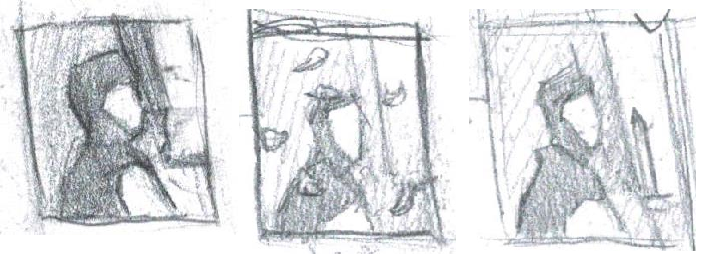
I began by making a few composition sketches to see how my ideas visualized.  These were mostly used to explore the placement of figures in relation to each other.

I took a picture of the library wall and digitally erased the space for the lunette. I printed the image out and drew a design for the space that was based on my composition sketches and informed by old master paintings.

 Composition Studies
I was really inspired by how Tiepolo's frescoes in the Würzburg Residence use perspective and the architecture to create the illusion of another world. So I made a few composition studies of his work to help me organize my composition.
Tiepolo's frescoes in Würzburg Residence
I was inspired by the drama in Tiepolo's painting.  For my mural design I based the pose of the person reading and pointing to the Pharaoh on this part of Tiepolo's painting.


These studies mainly focused on the grouping of dark and light values.  Tiepolo's work has a lot of drama which seemed to be influenced by the diagonals that lead to focal points at the top of triangular shapes.  It also helped to see how much the contrasts of value created a sense of drama and the areas of most focus had the most contrast of value.

I made my first design for this idea using my own drawings and old master paintings for areas that I didn't have references for at the time.  For example, in this image, the horse is from a Ruben's painting and the figure pointing is from Tiepolo's fresco.

This was another idea I had to incorporate the entire space of the wall but it seemed too much to take on when we only had a month to design the mural.

Preparatory Drawings & Paintings
I made preparatory drawings for my design from life.  I just used myself to work from and altered the proportions with references to old master paintings for female subjects.
I didn't have enough information for the hands in my figure study so I made additional drawings of the hands. These hand drawings took me about 6 hours each.  I made a few anatomical studies on the side to help determine where forms were actually ending.
I made these painted hand studies for reference to the color while I would be painting.  They took about 3 hours each.  Painting the one of my right hand with my left hand was interesting.

I was trying to follow a method of premilinary studies that many artists used in the past before beginning a painting.  I found that the less guessing I have to do while painting the quicker it goes.  For me, speed is a matter of implementing a series of steps at a paced progression.  The clearer I can be about what those steps are the more quickly the painting goes.

I was inspired by William Bouguereau's preliminary  hand studies, below, that he would do in preparation for most of his paintings.
William Bouguereau Hand Studies


These figure drawings took about 6 hours each while working from a mirror.  It took me about 60 hours to make the preparatory studies for this design.

While I was studying at Grand Central Atelier I really benefited from Colleen Barry's Structure Drawing class.  Each week we would take a break from our 80 hour long pose figure paintings and focus on 20 hour figure drawings to learn the essentials of the block-in and describing the structure of form in an efficient way. Her class really helped me to learn about ways to condense the understanding I was gaining during the longer poses so I could abbreviate form and focus on the most important aspects.  The shape of the contour block-in attains the illusion of light when the shape and dimension of the shadow are combined with a considered turn of value into the shadow.  These fundamental aspects of the drawing can describe enough about a form by itself to be used as a painting reference.  These insights have really helped me while creating preparatory studies for this mural design and while working on mural paintings.

I drew the Caribou from taxidermy at the Academy of Natural Sciences in Philadelphia.
Both the Moose and Horse were drawn from statues at the Washington Monument in Philadelphia.
Props
I made additional drawings of the props from life.

Portraits
I had portraits that were drawn and painted from life during my studies at Grand Central Atelier.  I used them to incorporate into my design.  Each of these studies took from 50 - 80 hours.
I worked from a teracotta cast of Charles Cordier's Nubian man sculpture. 


Using these references, I digitally compiled them into the mural design.

Painting Process

Transfer
I printed a 5 by 5 foot section of the mural to scale and transferred the drawing onto the cloth.  I rubbed graphite onto the back of the print.  When I pressed down on the outline around each object with the pressure of a pen a mark was pressed onto the cloth.
I tried to follow the dimensions of my design as carefully as possible so I thought about the dimension of each line as I transferred it. 
After the graphite transfer was completed I inked the drawing with an archival Micron pen so my lines would not disappear as I painted a watered down underpainting over them. 
Underpainting
I used Burnt Umber to paint my underpainting.  This stage allowed me to set up the value range for the painting without having to be overwhelmed by color.  I started by establishing my shadow values, which were the darkest end of my value range.


To make the process quicker I would mass in a general value for each subject and then tip the form towards the light with white or away from the light with more burnt umber.  This process felt more like working a drawing on toned paper.


Color Mixing
I mixed cups of colors for the painting before I started.  A benefit of being in the Mural Training Program was that we were supplied with the acrylic paint.
I used Titanium White, Yellow Ochre, Burnt Sienna, Burnt Umber, Cadmium Yellow, Cadmium Red, Venetian Red,  Black, Ultramarine Blue and Cerulean Blue to mix cups of colors for the painting.


I mixed a lightest, mid value and shadow color for each object in the painting according to the colors in my design.  Each cup was labeled with the object the color was for.
I set my palette by placing my pre-mixed colors around the edges and creating a gradation to pull from in the center.  I just use a plastic plate for my palette and scraped it off between sessions.

Organizing my colors helped me while painting the forms.  For example, the color on the eye of the caribou follows the progression of my pre-mixed colors.  As the form turns away from the light the color becomes proportionally darker and less intense in chroma.

Painting the Background
I started the sky by using burnt umber to set up the gradation of value from darker to lighter.
Then I painted the body of the pharoah and tapped some of the burnt umber into him to push his body into the distance.  After this I tried to carefully paint the color of the sky around the figure and caribou so they would have a sort of shield between them when I used a much larger brush to paint the rest of the sky.
I used my sky color and painted into the pharaoh.  Then I used a pre-mixed cloud color to transition into the sky.
Through using a large bristle brush with no water I built up a texture that was intended to create a cloud like atmosphere.

Portrait
I painted the portrait in oil paint because I needed the ability to manipulate the paint longer. Although I noticed that painting on this absorbent cloth caused the oil paint to dry within a few hours. I would have liked to paint the entire painting in oil but I had 3 weeks after the drawing was transferred to finish the painting before the show deadline.

I began the portrait by working on the forehead because it had a full range of turn from the area most turned toward the light down to a shadow.

I began by establishing a curve of form that went from the area most facing the light down to the side of the forehead.  I was looking for a path to establish the range of curve and value that the form had.

I built each path of form one plane at a time by carefully considering how much each plane was turning away from the position of the previous plane. I judged my decisions by seeing if the amount of opposition in value corresponded with how much each place was opposed to each other.  Looking at how much the lines of the contour edge were angled against each other gave me a clue in this while progressing down the path of the forehead. It almost feels as if including each new plane is like pushing a hinge incrementally more down until it feels to snap into place.
 Thinking About Planes
A plane is a flat surface that is turned toward or away from the light a specific amount.  Above is an example of 3 planes that are darker in proportion to how much they are bent away from the light.

I tried to focus on the organization of these larger planes while painting this portrait because it was larger than life size.  After I established the larger planes, as shown in the above progress images, I refined the curve by including intermediary planes to transition the curve of each plane into each other.  Sort of like adding another piece of a bridge in between two opposed planks to create a smoother surface.

Palette


The process of painting the portrait was significantly aided by organizing my palette to correspond with the drop off of value and intensity of color as the form turns away from the light.

From the top (right to left) I used Titanium White, Cadmium Yellow, Yellow Ochre, Burnt Sienna, Cadmium Orange, Cadmium Red, Alizarin Crimson, Raw Umber and Ivory Black to mix a string of colors for the flesh.  I was looking at the color in a few portrait paintings by Josh LaRock and Patrick Byrnes to set my color range.  The color string starts with the color of the area most facing the light. As the color string on the palette goes to the left the colors become darker and less intense in chroma.

 I mixed a pool of paint to pull from as I painted.  The bottom section of the pool is lower in intensity (chroma) by mixing raw umber into it.  When I am making subtle changes it can be more controlable to mix into a pool of paint that is only slightly changing.  The pool becomes like a rope ensuring that the color doesn't get too far away from the hue of flesh while also making it easier to visualize on the palette how far the color range can be pushed.

The blue pile on the left corner was used to paint the edge into the sky background.

With my color palette set up I just followed the form in my portrait drawing while keeping in mind that the value and intensity of color would drop off in equal proportion to how much each area turned away from the light.  A display of this concept is shown in the example below.


I continued building the portrait by painting one curve of form next to another.  Each new arc of form became slightly more bent away from the light than the previous.


Starting on a new form of the eye I began again at the plane most facing the light and bent down from there.
This process does require much time to consider the turn of each plane in relation to the light while building each form.  This was a larger than life size portrait and I worked on the forehead for 8.5 hours.  The entire portrait took me about 48 hours to paint.

Manipulating the Palette
As I moved into a redder area of the portrait on the eye I used more of my red string to mix into my flesh pool.  The redder section at the top of the pool is shown in this image.

Video segment of painting the forehead


One of the aspects that takes a lot of time to include is the subtle turn into the shadow.  There is such rapid rate of curve within a tiny space that it can take many attempts to organize this area.  I try to pull the value from my palette that can push the curve as intended into the shadow but working into wet paint can be difficult to manipulate.

Form by Form 
I continued to paint the portrait one form, one curve at a time.


 Hands
I painted the hands form by form as well.  It took me from 6 - 9 hours to paint each hand.

Clothing
I began the clothing by painting my shadows to the average value.
 Edges
I worked the edges along the clothing by thinning some of the shadow color with water and painting a border into the background.  Then I painted back into the edge of this edge color with the color of the sky to soften the edge.

 Form by Form
I focused on building one form at a time for the clothing as well.  I used acrylic paint for everything besides the portrait, hand and pharaoh so I could only work the wet acrylic in one area at a time.

Using the pathways of form helped me to develop a sense of how the forms were curving while painting the clothing.  I tried to build the form at first by bending one curve away from the previous.  I found that the more careful I was during this initial lay-in the less reworking I had to do.

Adding Texture
After I painted the form of each fold I had to adjust the form and using acrylic paint I had to paint over dried areas to do so.  Painting on top of the gradation of form with more of a dry brush method did allow me to suggest texture.

A massing in approach

Once I got to the dress I was running out of time, with only two days left before the deadline.  So I tried out an approach of first painting the value of the shadows to their full darkness and then thinly massing in an average color for each object before painting the form. Having the underpainting helped with this because some of the value from the underpainting just became darker with the wash so some suggestion of form was still there.

Then I painted the form one fold at a time over the massed in wash layer.

Painting the Caribou
I used the massing in approach for the caribou as well.  Especially since the Caribou was lighter in value the underpainting really showed through.  The difference between the wash in and the underpainting is shown on the shoulder.
 I painted the form on the caribou one curve at a time to lay it in.  And then I used more of a dry brush method to tip areas towards or away from the light and to add texture.

Adding texture
I was looking at Edwin Landseer's paintings to learn about mark making to suggest fur.  I mainly used a large house painting bristle brush and tried to push the contrast of value on the more upturned areas while leaving the edges jagged.

Edwin Landseer "Monarch of the Glen"

Final Painting

Click Image to View Larger
Photo Credit: Steve Weinik

This is the final painting.  I learned a lot during the process. It took me about 180 hours to paint.  Detail images are below.


Exhibition


My mural design and painting will be on display in the Mural Training Exhibition from January 9th - March 3rd, 2019.  The exhibition will also feature mural designs and paintings by Nico Bennett, Eric Bussart, Gregory Christie, Chabane Djoude, Marilyn Foehrenbach, Marissa Fu, Ashley Garner, Briana Keyes, Sarah Kolker, Natalie Flor Negron, Michele Pierson, Hilary Scott and Yael Tsoran.

I will be out of town for the opening, working on another mural project.  If you are in the area please visit the show.

Located at the Mural Arts Office, 1727 Mt. Vernon St., Philadelphia PA 19130.  www.Muralarts.org

Saturday, October 6, 2018

Mural Celebration


I had the opportunity to work with the Philadelphia Mural Arts Program in completing this mural for the 52nd Street Free Library of Philadelphia.  The mural was designed by Walé Oyéjidé using many images from classical art history.  The theme of the mural is a celebration of beauty in diverse people.

A celebration of the mural will be held at the library on October 20th, from 2 - 4 pm.
Student interns also collaborated on this mural with the intricate patterned borders and Kien Nguyen painted the section inside of the green bordered panel as well as the painting to the left of the library's entrance.

Here are a few images of the people and scenery that I painted for this mural.


Photo Credit - Steve Weinik


Photo Credit - Steve Weinik


Located at 52nd Street and Sansom Street., Philadelphia, PA 19139.

Monday, September 10, 2018

Fall Print Sale

Prints are now available at inprnt.com .  To receive 25 % off on Gallery-quality giclée art prints on 100% cotton rag archival paper, printed with archival inks , Stationary and  iPhone Cases, just use code R6UGXJ at checkout through September 16th, 2018.

Friday, July 6, 2018

Process for Amongst Ages Past


I used preparatory drawings of clothing, architecture and accessories, referenced master paintings and worked directly from life with a model to create this painting "Amongst Ages Past".  This piece is a part of The Great Library series and book I am developing.  A sample of the book can be seen on my website arthurhaywood.com

Every day scholars would pass from towering temples to breathtaking pyramids.  Centuries of achievement for Kings and Queens in that land inspired wonder.

Process

The process started with a linear drawing of the portrait to establish the shape, proportion and structure of the face.  This drawing was transferred to canvas using an oil transfer method. Doug Flynt describes this transfer method on his blog here.


I began this portrait in the studios of Grand Central Atelier.  Over the course of three weeks I worked from the live model to paint the portrait.  Each day I progressively painted one form at a time.  I had a general idea for the tone of the background so I painted the border a color I thought would establish the contrast I intended for the piece.  It was more manageable to adjust the softness of contour edges while both the portrait and the edge of the background were wet.  Although I changed the value of this border in places while working on the background later, the initial border color set up a base that was easier to develop upon.

Compositions and Color Study
I tried out some in quick composition sketches.  I settled on the simpler design on the left.

After making the composition sketches I had a sense for where I wanted to place the architecture, clothing and accessories.  Then I made a small study for the piece.  I took a picture of my painting as it had progressed so far and printed it out much smaller.  I explored options for color relationships in the background on this study before I added the scene to the final piece.

Preparatory Drawings
I completed a number of drawings from life to utilize as references while painting the clothing, architecture and bag strap on her shoulder.

I used graphite and white charcoal to make this drawing of the shirt and satchel strap on myself in a mirror.

I visited the Egyptian Temple of Dendur at the  Metropolitan Museum of Art to make this study.  I gained more clarity about details such as chips and the structure of the building elements by drawing the temple from life.  Also, this drawing study gave me a sense of how subdued the contrast appears on the hieroglyphs in life.

References
I referenced master paintings to inform ways to describe the texture and form of objects.  A few of the paintings I referenced are shown below.

I referenced Bouguereau's Girl with a Pomegrante in painting the clothing.

I studied a painting by Hubert Robert to see how to incorporate the texture and color of ancient bricks.
 
The relief sculpture in Frederic Leighton's Self Portrait was helpful in getting a sense of  subtle suggestions of form while painting the hieroglyphs.


The background in Alma Tadema's The Colesium was referenced in painting the sky.

This image of Egyptian architecture at the Metropolitan Museum of Art guided me in choosing the color for the wall.  Many details were not as clear in this image as when I was making my drawing study from life.

Drawing on Canvas

The design for the piece in the color study guided me in placing the architecture and clothing on the canvas. After painting a layer for the background of the wall I drew the hieroglyphs.  I used vine charcoal to draw with because it is easy to erase.  After the proportions were established with line I was ready to move onto painting the hieroglyphs.

Blocking - In the Hieroglyphs


I painted the larger planes of shadow and upturned areas on the hieroglyphs somewhat loosely to suggest a texture for the wall.   I kept this layer on average a bit darker than the final value I intended for the wall.  I did this because I would be adding another layer on top with broken brush strokes that would be brighter in value to suggest texture.  The contrast of the darker under layer poking through the broken brush strokes in the next layer would create an appearance of a rougher surface.  I used this technique in painting textures of all the objects in the background, including the wall, sky, clothing and satchel strap.  In the sky the lighter layer was used to suggest a softer atmosphere.

Revisions
After a layer for the entire painting was in place I set the piece aside for a while.  Returning to the canvas I applied a layer of retouch varnish over the painting to bring back areas that had lost their gloss during the drying process.  Paint often dulls in value after oils that are on top of the surface while the paint is wet are later absorbed into the canvas while drying. This layer of retouch varnish or oil restores the value and color to how it was initially painted and would return to in a final varnish.  I primarily used oil during the painting process to restore the color of areas that I would be working on top of or next to.  The mixture I used consisted of a ratio of 2 parts Odorless Mineral Spirits and 1 part Walnut Oil, which produces quite a clear medium. 

With the actual color of the piece restored I then evaluated areas that stood out for me to adjust and made notes on reasons for making changes.  I proceeded to address these concerns one by one while revising the painting.  I would use Oleogel as a medium to slightly thin out paint while making revisions

Below are a few close up images of the painting with the added layer of texture and revisions.


More posts on the process behind my paintings will be shared soon.

Sunday, May 27, 2018

Thank You Grand Central Atelier!

I am very fortunate to have graduated from Grand Central Atelier this Spring.  I have much gratitude to all my teachers throughout the program, Jacob Collins, Colleen Barry, Will St. John, Scott Waddell, Ted Minoff, Tony CuranajJosh LaRock, Devin Cecil- Wishing, Justin WoodAnthony Baus, Patrick Byrnes, Greg Mortenson, Katie Engberg, Brendan Johnston, Katie Whipple, Sally Fama Cochrane, Zoe Dufour, Charlie Mostow and Sandra Sanchez, school administrators, Joy, Justine and Mariya, all the fantastic models, inspiring resident artists and fellow students, art history lecturer, Michael Djordjevitch and everyone who has been so supportive of my endeavors, for making my studies at Grand Central Atelier such an amazing experience.  Thank you.  With your help I have been able to significantly improve the technical expression in my paintings. 

Below are a few paintings in progress from the past month at Grand Central Atelier.  These pieces are being developed as part of a series on scholars from the ancient library of Alexandria.  The paintings are designed to be compiled into an exhibition and book.  To preview the book, "The Great Library" visit here.

"Archimedes Thoughtful" Oil on linen, 20 x 22 inches (in progress)
Color study for final painting
Archimedes was one of the ancient world's most revered mathematicians and engineers.  His research into geometrical theories proved  methods for calculating the density of objects.  These discoveries led to calculating the volume of the universe measured by how many grains of sand could fit into it.  His desire to determine a finite boundary was based on a view of the sun and moon rotating around the earth.  The astronomer, Aristarchus, proposed that the earth rotated around the sun and the expanse of the universe to be vastly larger than it was perceived at the time, maybe infinite.


He suggested that the earth's orbit rotating around the sun was so small that it compared to the size the center of a sphere has in relation to its boundary.  A center could be divided infinitely.  Archimedes could not accept the idea of determining the limit of an infinitely large universe that rotated around the sun.  This conflict left the mathematician caught between a finite and indeterminably large view of the universe.

 "Eratosthenes" Oil on linen, 15 x 19 inches (in progress)

Color study for final painting

 In depth wonder led many scholars from the library of Alexandria to make notable discoveries.  Eratosthenes discovered the circumference of the world.

By finding that Alexandria and Syene (modern day Aswan) lie on the same Longitude  he calculated their distance on  a summer solstice.  He began by assuming that the sun was so far away that its rays were parallel.  Noting that the sun cast no shadow in Syene, when seeing a man's shadow block the reflection of the sun into a well, he calculated the angle of the shadow from a stick in Alexandria.  This allowed him to find the proportion of difference in the distance from Syene to Alexandria along the scale of the earth's circle.  He knew the 7 degree angle shown from the shadow in Alexandria to be 1/50​th​ of a circle.  Therefore, the distance from Alexandria to Syene was equal to 1/50th of a complete circle.  By multiplying the distance of Syene to Alexandria, 5,000 stadia, by 50 Eratosthenes calculated the earth’s circumference.
These are only a few pieces of many that are being painted for this series on scholars from the library of Alexandria.  I will post updates as the series develops into completion.  There is much more to come.


Sunday, May 20, 2018

Atelier Exhbition


Four of my paintings will continue to be on view in Grand Central Atelier's "Atelier Exhibition through August 23rd, 2018.

Summer Viewings: May 26th - August 23rd,  Saturdays 12 - 4 PM, Thursdays 3 - 7 PM

Located at Grand Central Atelier, 46 - 06 11th Street, Long Island City, NY 11101

The other two paintings on view are shown below.
 "Limitless" Oil on Linen, 9 x 11 inches
"Moonlight Monk" Oil on Linen, 9 x 12 inches

Thursday, May 17, 2018

The Great Library ( Preview )

I have been developing a book about scholars from the ancient library of Alexandria.  In the largest library of the ancient world everyone wanted to make the greatest discovery.

Below is a preview of the book.  I am currently working towards completing the remaining paintings for the book.