Thank you so much to everyone who has generously supported The Arthur Haywood Education Initiative through donations and thanks to the kind support of those who have shown encouragement of this project on social media and elsewhere. I am sincerely grateful for this gracious support that has allowed The Arthur Haywood Education Initiative to reach its funding goal for art supplies! This support will allow me to significantly enhance my art during my first year of study at the Grand Central Atelier.
I am sincerely grateful for those who have been extremely generous to donate towards funds for art supplies. These supporters include, Daniel WK Chow, Kate Williams, Julie Haywood, Lilah Galdi, Andy Heimann and Keanu Baxter .
I have recently purchased many of the art supplies by adding the funds to a Blick gift card and will be using the gift card to purchase a few more supplies (a few more pieces of Artistico Fabriano paper) during the school year.
Updates on artwork that I will be making with the art supplies from my studies at the Grand Central Atelier will be posted on this blog in December 2015 and May 2016.
Thank you so much!
To view the Arthur Haywood Education Initiative kickstarter page, please click here.
In
September of 2015, I am honored to begin studying full-time at the Grand Central Atelier to gain technical skills that are vital to conveying my visual
expressions to their full potential. To assist in my development, I
have started a project called The Arthur Haywood Education Initiative.
Please view the video above for more information. For further information and to support by July 24th please visit: my kickstarter page.
I also have prints available until July 24th. The proceeds will benefit the
funding for art supplies during my first year of study at the Grand Central Atelier. For further information and to support please visit my kickstarter page.
Thank you!
Thank you so much to everyone that was able to visit my art show and the
kind people who have supported my work through the purchase of some of
my pieces. I am sincerely grateful for all of the encouragement and
support that I have received for my art work.
I was glad to meet so
many great people at the reception. The show will be on display
at the Philadelphia Sketch Club for one more week, so thanks in advance
in case anyone may be able to view the show during that time. For more
information, please visit www.ahaywoodfineart.com/p/study-to-synthes.html
My exhibition "Study to Synthesis" will be on display from June 3rd -30th, 2015 at The Philadelphia Sketch Club, located at 235 S. Camac Street, Center City, Philadelphia, PA 19107.
Admission is Free and Open to the Public.
Gallery hours are Wed, Fri, Sat, Sun from 1 - 5 PM.
Reception: June 21st, 2 - 4 PM
Below are a few images from the exhibition. To preview the works from the exhibition please visit the show's Online Gallery.
It is a special honor that I will have a group of my drawings and paintings on display at The Philadelphia Sketch Club this June.
The exhibition "Study to Synthesis" focuses on classical studies that have significantly informed the depictions of aspiration in the narrative portraits on display. Each of these studies was created with the intent to develop technical skill in representing the particular character of each subject in a believable way. The understanding gained from these studies has manifested in the creation of narrative portraits whose emotional qualities gain significance from countless hours of investigating the expressive reality of nature.
The exhibition can be previewed on the show's Online Gallery
"Inspiration" Graphite, White Charcoal and Watercolor on paper
While working on my drawing "Inspiration" I utilized a process that helped for modeling on toned paper.
This sphere study that I made before starting my drawing shows how I went about using my materials while modeling.
I used the tone of the paper to represent the similar value of a plane on the sphere turned away from the light source. All areas on the form that turned down from that plane became darker in value, while all areas that turned up (towards the light source) from that plane became lighter in value. Essentially for my portrait drawing, any part of the portrait that was darker than the tone of the paper became darker with graphite and any part of the portrait that was lighter than the tone of the paper became lighter with white charcoal.
Scott Waddell wrote a very helpful article about modeling on toned paper, which can be purchased at ArtistsNetwork.com and Anthony Ryder has some very helpful advice for drawing on toned paper in his book, The Artist's Complete Guide to Figure Drawing.
Also, I used photographic references for this drawing and found it useful to take many images of the portrait from various angles to help with a three-dimensional understanding of the form while working from the photographs.
This is a very large image and the full-size image of this timeline can be viewed hereto be examined.
Out of curiosity in how many of the traditional figurative painters of the past were connected to 21st century traditional artists through the exchange of techniques and information, I did some research and made the bulk of this illustrated timeline in 2012. Although a lot of artists are mentioned in this timeline, there are many great and notable artists that I was not able to include in this timeline. (For no reason other than that my research and time was limited). This timeline investigation extends to the early 21st century with some notable artists who have taught many other notable 21st century artists who are currently exchanging valuable techniques and information to others in-person and digitally in this contemporary age.
I am presenting this art history timeline investigation to possibly receive information on how Squarcione, Verrocchio and Giotto may be connected. My resources for this timeline consisted of museum websites, artist biographies, Wikipedia and the Art Renewal Center website. If there are any art historians or people familiar with art history that would be willing to respond to my inquiries it would be very helpful. Thanks.
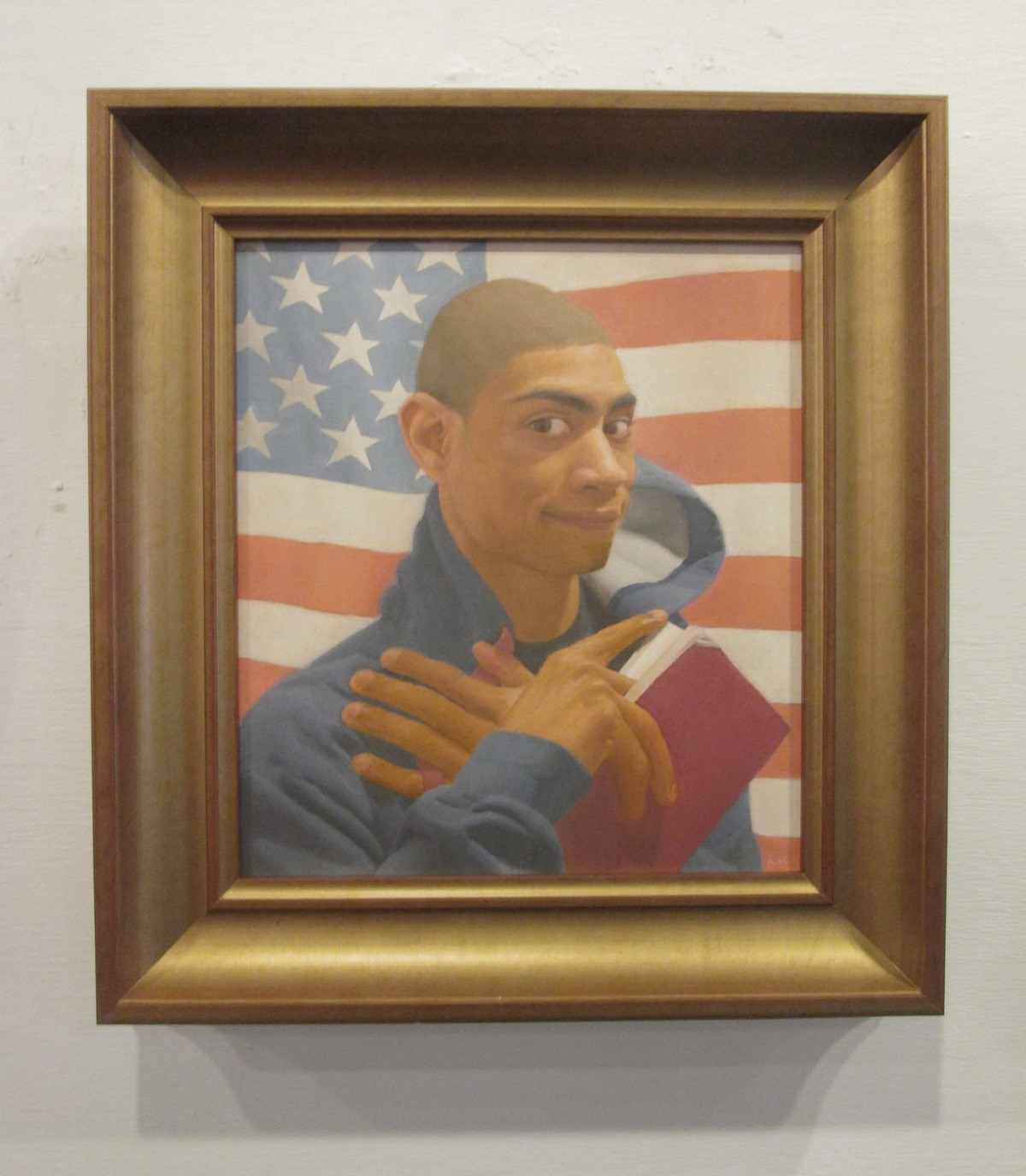
I was working on a painting video that shows the process I was using while working on my painting, titled "I will be brave" (shown above). This post shows a few clips and information that I was editing for the video. I did not include audio into these clips but descriptions of the clips are in this post. (Please excuse the shakiness of the footage. The setup of space between me, my easel and mirror did not allow room for me to set up a tripod to stabilize the footage, so I had to hold the camera with my left hand while I was painting.)
Color Mixing
I approached color mixing by adjusting a color's hue, value and chroma.
Hue - Includes colors that range from yellow, red, purple, blue and green.
Source: Wikipedia
Value- Lightness or darkness of a color.
Source: Wikipedia
Chroma - Intensity of a color from neutral to most intense.
Source: Wikipedia
Below is a video that displays color mixing.
I was aiming for a yellow-red hue that was light in value and high in chroma. My palette consisted of Titanium White, Cadmium Yellow, Yellow Ochre, Cadmium Orange, Cadmium Red, Burnt Sienna, Alizarin Crimson, Raw Umber and a few neutral values (from white to black).
So I started mixing with the yellow-red hue of Cadmium Orange and adjusted the Hue a bit more yellow with a color that was more yellow, Cadmium Yellow. Once the hue was established, I adjusted the Value with a much lighter color, Titanium White. Once the hue and value were established, I adjusted the Chroma (Intensity) of the mixture. I was aiming for a color that was higher in chroma than my mixture so I added colors that were higher in chroma (and yellow-red in hue), Cadmium Yellow and Cadmium Orange.
For the next mixture I reduced the chroma with a color that was less chromatic than my mixture, Raw Umber. This caused the mixture to reduce too much in chroma so I added some Cadmium Orange and Cadmium Yellow to raise the chroma.
More information about color mixing can be found on Gamblin's Website. I relate to his term of "cool colors" as colors that are low in chroma (intensity).
Modeling In Strips
I made a short demonstration of the modeling process that I used on an imaginary strip.
After initially placing 3 large planes on my strip I added a few smaller planes to bend them into each other. This process of bending larger planes into smaller planes is known as subdivision. I continued to bend the form, although I was adjusting much smaller planes, by more subtlety turning those planes into each other. As the form turned toward the light I pushed it lighter in value and more chromatic in color. As the form turned away from the light I pushed it darker in value and less chromatic in color. This process continued as I refined the strip by sculpting the structure of its form with value and color.
I was striving to create a gradation that described the curvature of form. While it can be difficult to perceive the subtle differences in the gradation at a glance, isolating the gradation into a strip made it easier to notice the subtle changes in value and color that describe the form's structure.
Below is a video of me using the process of modeling from planes to refining on the forehead in my painting.
The direction of the strip was determined by the direction of the form's most curvature from the light, meaning the most change from light to dark on the form. I added another strip below that strip to paint the entire form of the forehead and continued painting the portrait one form at a time.
Considering Terminator Edges
In the video clip I spent some time trying to refine the clarity of the terminator edge (shadow edge) on the forehead before making adjustments to the curve of form.
Although the gradations leading into the terminator edge is much more subtle for the sphere on the right, upon closer inspection the clarity of the terminator edge itself (not in comparison to the gradation leading into it) is similar to the terminator edge for the sphere on the left.
I found consideration of the terminator edge useful because, since the terminator is the hardest edge on the form, its clarity can set a standard for the level of resolution for the form. Even though the gradation leading into the terminator edge on the forehead was subtle, I tried to consider the clarity of the terminator edge on that form and all of the forms in the painting.
I have recently been studying the texture of fur while working on a commissioned painting of two dogs. This post describes how I approached representing the texture of fur. My thought process for modeling fur was greatly enhanced by Scott Waddell's Still Life Demonstration video on representing fur and Doug Flynt's advice to focus on considering the texture of fur in terms of planes.
The Process I Used
I will describe the process that I used through an example of a small section of the painting.
Underpainting
I began with a thin underpainting, thinned with turpentine, to get a quick sense of the large planes of form. This underpainting was applied to the entire painting as well. The underpainting also assisted in making sure the light color of the canvas did not show through while applying paint during the next step.
Large Planes
I then painted in a few distinct planes of form. I painted one plane at a time and while placing in adjacent planes I focused on how much each plane was facing towards or away from the light source. I started with the plane most facing the light and attempted to gain a feeling of each new plane bending away from the preceding plane.
Modeling
Then I tried my best to model a sculptural representation of the form. This process was focused on bending the large planes into each other to create a more subtle curve of form. I intended to model the form smoothly during this stage, as if the form was made of plastic, to make it easier to focus on the sculptural quality of the form.
Setting up the Fray
I set up the fray from the fur on the neck into the shoulder. Since the shoulder was darker than the neck I made a thin band of a color that was a bit darker than the neck and placed it next to the right edge of the neck. I let the edges of this band fray into the darker color of the shoulder. Since the paint was wet while I was working on this form it was easier to blend the edges of the band of fray into the shoulder.
Examining Fray
This diagram shows a simplified version of the fray of fur. The image on the left shows a microscopic image of distinct strands of fur fraying into the gray background. As the fur frays into the background less of a solid area of fur is seen and the color behind it shows through. While this distinction is very apparent upon a close view, the small image on the right shows how the interaction between the fray and the background influences the color and soft edge of the fray at a normal viewing distance. Because the area of the fray shows both the fur color and background color seen together that area is a bit darker than the solid area of fur. That darker band of fray is what I focused on representing when setting up the fray of fur in my painting.
Adding Fray
Adding the more distinct areas of fray was focused on distinguishing the areas of fur form that were most opposed. The more opposed the planes of fur are, the more distinct the edges of fur are perceived. I focused on adding more distinct fur where I perceived that opposition most clearly and let the other areas remain closer together in value.
I found it helpful to consider this opposition of planes of form in relation to the distinction of blades of grass. In the image below, the top leaves of grass are most distinct where the grass below it is grouped together as it is turned more away from the light.
While applying the strokes of fur I focused on making the direction of my marks in the direction that the fur was emitting from the form. I found it helpful to use a more thick amount of paint and a worn brush tip at the edges of the fray to attempt to mimic fraying strands of fur.
Study of an eye made under the guidance of Scott Waddell in a portrait workshop.
As form turns away from the light it becomes darker in value and less intense (less chromatic) in color. Therefore in painting, specificity in gradations reveals the structure of form.
As the sphere turns away from the light it becomes darker in value and less intense (less chromatic) in color. The hue (property of color pertaining to the spectrum of colors, whether blue, yellow or in this example, orange) remains the same for the entire sphere. The hue of a form can be determined by a form's local color.
Local color is the inherent color of a form under the specific lighting scenario. A form's local color can be identified at the point where a form is most facing the light. As the form turns away from the light, less of the local color is diffusely reflected and the form becomes darker in value and less intense (less chromatic) in color. The reason for this phenomenon is based on a form's orientation to the light source(s).
Light's Interaction With Form
Many light rays are projected from the light source in every direction. The image on the left only shows a small number of the millions of light rays emitted from a light source. (Please note, these diagrams are simplified for illustration purposes only).
Each of these light rays is made up photons. A photon is essentially a microscopic piece of light. Photon's are made up of wavelengths from the color spectrum (consisting of colors ranging from red, orange, yellow, green, blue and violet). The quantity of the wavelengths from photons projected from an object causes the combined wavelengths of photons to appear as a specific color. Photons are made up of the same color properties of the light source and their combined make up is very influenced by any form that it interacts with.
(Doug Flynt has published a very informative article on the reflection of colored light on his blog here).
(Please note, this diagram is simplified for illustration purposes only). A single photon alone does not reflect the color of an object. The combination of the wavelengths from photons reflected from an object portrays an object's color properties. Technically speaking, the arrow in the diagram can be thought of as a combination of light rays (paths of photons) whose wavelengths combined to portray the orange color shown.
The photon originally was composed of wavelengths that when combined with the wavelengths of the millions of other photons emitted from the light source appeared as white as the light source. Once projected from the light source, the photon traveled in its light ray to meet the orange sphere. Due to diffuse reflection, once the group of photons emitted from the light source interact with the sphere some of the photons and their wavelengths are absorbed by the sphere while some photons and their wavelengths are reflected. This interaction causes the wavelengths of the reflected photons to combine and reflect the color properties of the sphere. (Scott Waddell has also created a very informative video on the science of light that can be viewed here). Photons continue along their path to enter a viewer's eye and make up the images that one sees.
There are millions of light rays that strike a form. The diagram above shows, in a constricted sense, the distribution of light if six light rays were projected from a light source. The more a plane is facing the light the more light rays can reflect off its surface area.
In this example, because plane A is most facing the light it receives 3 light rays, plane B receives 2 light rays and plane C only receives 1 light ray to reflect. Therefore the less light that is received by a plane the less light rays can reflect the color of planes. And as the planes turn away from the light they become darker in value and less intense in color.
The interaction between light and form creates specific gradations that are essential to conveying the structure of form. Although much of this post discussed color, drawing has a critical role in representing these gradations. No matter the color of a form, representing the structure of form is entirely dependent upon the drawing of the shapes of form and its gradations in value.
The type of analysis into gradations that I have presented in this post may seem to be over complicated. So I would like to include a statement describing why these types of investigations into the appearance of form have been important to my artistic development.
It is my understanding that the representational art that I am pursuing to make has much less to do with any "skill" as it has to do with awareness and acceptance of what one sees (both optically and conceptually).
For example, once one accepts that the images they see are composed of shapes one can draw the subtleties that one is aware of in those shapes. Once one accepts that form is turning more or less towards the light one can represent the turning of form that one is aware of. This theory even extends to material handling. Once one accepts that the gradations in their piece represent sculptural volume and that their tool of a pencil or brush is a chisel, one becomes aware of how to apply their chisel to affect their sculptural piece in an intended way.
In my opinion, the most important ability that I am striving to develop in my representational pursuits is the discipline to become and remain aware of what is occurring without interruption in my thought process. The most beneficial aid that I have found in this pursuit is acquiring more information on the science of light on form, because nature holds no secrets. By enhancing my understanding of what is percieved I may heighten my awareness to more fully represent what is seen.
While working on a cast painting study I was struggling with understanding how the structure of form was bending. By simplifying each form into small strip like sections and focusing on how the axis of each strip was turned I was able to better understand the form's structure.
Use of Strips
Even understanding the subtle turning of form on a sphere can be difficult. But by simplifying the sphere into large planes that define its structure one can gain a less complicated realization of a form's structure.
The section on the sphere outlined in red represents a strip of form.
By further simplifying the planes on the sphere into strips, or slices, of form one can approach modeling with a simpler and clearer sense of a form's structure.
I have found painting in strip like sections of form to be very helpful in gaining a better understanding of a form's structure. I began modeling the sphere by simplifying a strip into a few distinct planes, as shown in the image on the left. Then I simply turned each of those planes into into each other to gain a more subtle curve of form. I would continue painting small strips of form next to each other, using the same process, until the entire form was painted in.
Simplifying Complex Forms
The study of part of an ear cast above was painted in strips of form.
While the sphere was a more simple form to investigate, considering the position of each strip can be very helpful for better understanding more complex forms.
Each strip of form has a specific orientation to the light. To more easily comprehend each strips orientation to the light one can imagine an axis running through each strip. By imagining each strip being pulled on its axis, as if the axis was a lever or handle, one can more easily approach investigating the curving of complex forms.
A step by step diagram, left to right, of strips being turned by their axis to make up a complex form. Since I was working in strips while painting the ear study above this is the thought process that I was using to simplify that complex form.




alt.%2Bvers.png)


png.png)