
Click Images to View larger

"The Wonder of Reading"
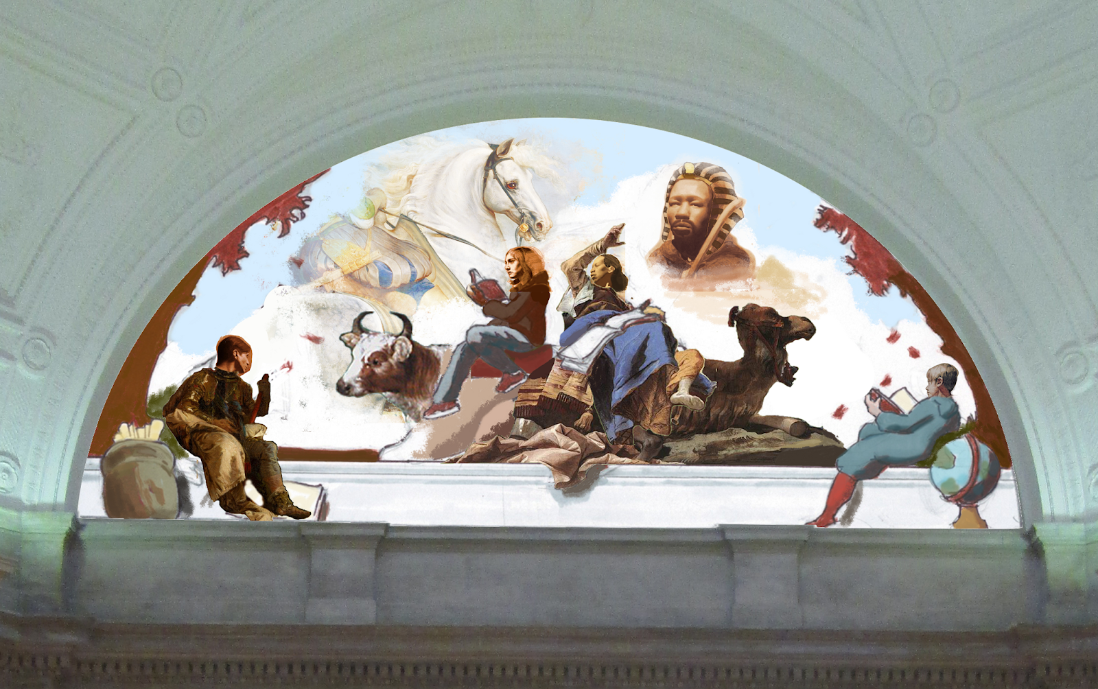
Mock Design for the Parkway Central Library
1901 Vine St, Philadelphia, PA
1901 Vine St, Philadelphia, PA
This design developed as student assignment in Philadelphia's Mural Art's Mural Training Program. My work celebrates academic achievements and aspirations of diverse people. This mural design was an opportunity to explore expanding my work to a public context. My design for the wall above the entrance stairway in the Parkway Central Library is composed to visualize how reading can bring stories to life. As the people read, characters appear in the clouds of their imagination. A galloping stallion in front of the Colosseum transitions into an ancient pharaoh.
I chose this space because as a free library it is an accessible place for learning. The Parkway Central Library offers reading resources that are essential to broadening one’s awareness and in creating opportunities for people. The architecture of the round lunette in this staircase presented an opportunity to suggest the illusion of another world behind the horizontal cornice. This illusion intends to create a sense that a world where learning is vastly captivating exists within the library.
This image was created through digitally compiling drawings and paintings that I made from life. The Colosseum was referenced from Hubert Robert’s Colosseum and the trees were referenced from William Bouguereau’s Rest. This post describes the step by step process I took in designing and painting a section of this mural.
Design
This design developed as a student assignment in Philadelphia's Mural Art's Mural Training Program. As part of the Mural Training Program with Dave McShane, I benefited from lectures about aspects of mural making, from the logistics of budgeting and contracts to the process for proposing and completing a mural. I designed a mural for a site of my choice (the Parkway Central Library) and received feedback from the class. Each student had the opportunity to paint a scaled 5 by 5 foot section of their design on our own. I will be describing the steps I went through for this project. It took me about 45 hours to prepare the digital design.
Composition Sketches


Composition Studies
I was really inspired by how Tiepolo's frescoes in the Würzburg Residence use perspective and the architecture to create the illusion of another world. So I made a few composition studies of his work to help me organize my composition.
 |
| Tiepolo's frescoes in Würzburg Residence |

I was inspired by the drama in Tiepolo's painting. For my mural design I based the pose of the person reading and pointing to the Pharaoh on this part of Tiepolo's painting.


Preparatory Drawings & Paintings
I made preparatory drawings for my design from life. I just used myself to work from and altered the proportions with references to old master paintings for female subjects.


I was trying to follow a method of premilinary studies that many artists used in the past before beginning a painting. I found that the less guessing I have to do while painting the quicker it goes. For me, speed is a matter of implementing a series of steps at a paced progression. The clearer I can be about what those steps are the more quickly the painting goes.
I was inspired by William Bouguereau's preliminary hand studies, below, that he would do in preparation for most of his paintings.
 | |||
| William Bouguereau Hand Studies |


I drew the Caribou from taxidermy at the Academy of Natural Sciences in Philadelphia.

Both the Moose and Horse were drawn from statues at the Washington Monument in Philadelphia.

I made additional drawings of the props from life.


Portraits
I had portraits that were drawn and painted from life during my studies at Grand Central Atelier. I used them to incorporate into my design. Each of these studies took from 50 - 80 hours.

I worked from a teracotta cast of Charles Cordier's Nubian man sculpture.


Using these references, I digitally compiled them into the mural design.
Painting Process
Transfer
I printed a 5 by 5 foot section of the mural to scale and transferred the drawing onto the cloth. I rubbed graphite onto the back of the print. When I pressed down on the outline around each object with the pressure of a pen a mark was pressed onto the cloth.
After the graphite transfer was completed I inked the drawing with an archival Micron pen so my lines would not disappear as I painted a watered down underpainting over them.

I used Burnt Umber to paint my underpainting. This stage allowed me to set up the value range for the painting without having to be overwhelmed by color. I started by establishing my shadow values, which were the darkest end of my value range.


I mixed cups of colors for the painting before I started. A benefit of being in the Mural Training Program was that we were supplied with the acrylic paint.
I used Titanium White, Yellow Ochre, Burnt Sienna, Burnt Umber, Cadmium Yellow, Cadmium Red, Venetian Red, Black, Ultramarine Blue and Cerulean Blue to mix cups of colors for the painting.


Painting the Background


Portrait
I painted the portrait in oil paint because I needed the ability to manipulate the paint longer. Although I noticed that painting on this absorbent cloth caused the oil paint to dry within a few hours. I would have liked to paint the entire painting in oil but I had 3 weeks after the drawing was transferred to finish the painting before the show deadline.
I began the portrait by working on the forehead because it had a full range of turn from the area most turned toward the light down to a shadow.


Thinking About Planes

I tried to focus on the organization of these larger planes while painting this portrait because it was larger than life size. After I established the larger planes, as shown in the above progress images, I refined the curve by including intermediary planes to transition the curve of each plane into each other. Sort of like adding another piece of a bridge in between two opposed planks to create a smoother surface.
Palette

From the top (right to left) I used Titanium White, Cadmium Yellow, Yellow Ochre, Burnt Sienna, Cadmium Orange, Cadmium Red, Alizarin Crimson, Raw Umber and Ivory Black to mix a string of colors for the flesh. I was looking at the color in a few portrait paintings by Josh LaRock and Patrick Byrnes to set my color range. The color string starts with the color of the area most facing the light. As the color string on the palette goes to the left the colors become darker and less intense in chroma.
I mixed a pool of paint to pull from as I painted. The bottom section of the pool is lower in intensity (chroma) by mixing raw umber into it. When I am making subtle changes it can be more controlable to mix into a pool of paint that is only slightly changing. The pool becomes like a rope ensuring that the color doesn't get too far away from the hue of flesh while also making it easier to visualize on the palette how far the color range can be pushed.
The blue pile on the left corner was used to paint the edge into the sky background.
With my color palette set up I just followed the form in my portrait drawing while keeping in mind that the value and intensity of color would drop off in equal proportion to how much each area turned away from the light. A display of this concept is shown in the example below.


Manipulating the Palette

Video segment of painting the forehead
One of the aspects that takes a lot of time to include is the subtle turn into the shadow. There is such rapid rate of curve within a tiny space that it can take many attempts to organize this area. I try to pull the value from my palette that can push the curve as intended into the shadow but working into wet paint can be difficult to manipulate.
Form by Form
I continued to paint the portrait one form, one curve at a time.


I painted the hands form by form as well. It took me from 6 - 9 hours to paint each hand.


I began the clothing by painting my shadows to the average value.


Form by Form
I focused on building one form at a time for the clothing as well. I used acrylic paint for everything besides the portrait, hand and pharaoh so I could only work the wet acrylic in one area at a time.


Adding Texture

A massing in approach


Then I painted the form one fold at a time over the massed in wash layer.
Painting the Caribou


I was looking at Edwin Landseer's paintings to learn about mark making to suggest fur. I mainly used a large house painting bristle brush and tried to push the contrast of value on the more upturned areas while leaving the edges jagged.

 | ||
| Edwin Landseer "Monarch of the Glen" |

Click Image to View Larger
Photo Credit: Steve Weinik
This is the final painting. I learned a lot during the process. It took me about 180 hours to paint. Detail images are below.


My mural design and painting will be on display in the Mural Training Exhibition from January 9th - March 3rd, 2019. The exhibition will also feature mural designs and paintings by Nico Bennett, Eric Bussart, Gregory Christie, Chabane Djoude, Marilyn Foehrenbach, Marissa Fu, Ashley Garner, Briana Keyes, Sarah Kolker, Natalie Flor Negron, Michele Pierson, Hilary Scott and Yael Tsoran.
I will be out of town for the opening, working on another mural project. If you are in the area please visit the show.
Located at the Mural Arts Office, 1727 Mt. Vernon St., Philadelphia PA 19130. www.Muralarts.org