I recently have been taking some linear block-ins drawn from life and utilizing applied perspective, working from imagination and referencing master paintings to create narrative works. This post describes the process I used to make my drawing "Explore", graphite on paper, 6.75” x 5.75” inches.
A summary of the narrative:
This vast city which once was the home of an advanced civilization still hosts relics of its former greatness. A journey that was led by readings into the ancient world has led our protagonist to wondrous territories. As she walks through the eternal city she collects flowers that are growing. Transporting them to a new home.
This piece began as a linear block-in at
Grand Central Atelier last year. I rendered the drawing by referencing master paintings, conceptualizing light on form and imagining some elements of the piece.
This is the linear block-in I drew from life during a two hour portrait sketch session at
Grand Central Atelier. I lost some information after I transferred the drawing in the next stage. I will have to pay more attention to retaining the shapes in my block-in while I develop my modeling in the future.
Modeling the Portrait
I transferred the block-in to a piece of Artistico Fabriano paper, 140 lb. hot press paper and began modeling the portrait one form at a time. I filled in my shadows and started modeling on the nose. Since I only had my linear block-in to reference I utilized the concept of light decreasing as form turns away from the direction of the light to guide my modeling. I still used strips of form to assist in simplifying the process of conceptualizing form while modeling the portrait.
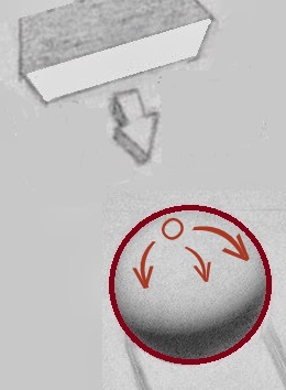
I thought of imagining the modeling on each form based on how much each area of the form turned towards or away from the direction of the light. An exercise I have often practiced is to render a sphere from imagination. This exercise requires an awareness of the structure of a form to determine how to describe the curve of form with value. Imagining the modeling on different forms in the portrait, such as the nose, was just an extension of this exercise to differently shaped forms.
The Contour as a Guide
Because a sphere is equally round in all directions, as seen in the equal curve of the contour, the sphere is modeled from imagination by turning the form away from the light most facing area equally in all directions until it meets the shadow edge. According to this concept the form becomes incrementally darker as areas turn more away from the light most facing area.

In the example for the ball of the nose, the structure of the nose was described by the shape of the contour in the linear block-in. The nose is similar to the shape of a sphere but slightly more angular, which is reflected in the more angular curve of the modeling of the nose. Essentially the linear block-in described the structure of the form and I tried to follow the information it portrayed to imagine how to describe the volume of form with value while rendering the portrait. From the outer contour I could imagine the interior contours that would relate to those outer contour tilts inside the form. I proceeded modeling by sculpting the form away from the light most facing area by incrementally making planes darker with my pencil and responding to the angular plane changes on the nose.
Additional Master Painting References
I also utilized referencing master paintings that portrayed a similar
light orientation and pose to the portrait I was drawing. One of the
portraits from Leonardo da Vinci's painting "The Virgin of the Rocks" and a
painting by Scott Waddell, seen
here, were some of the paintings which were helpful to reference for modeling forms on the portrait.
I proceeded one form at a time until I had modeled the entire portrait. During the time period I was modeling I began thinking of different narratives to include with the portrait and loosely sketched in some elements of a composition.
Composition studies
I loosely had an idea of the portrait portraying a traveler. To finalize a specific narrative idea and composition I made numerous small composition sketches to explore the potential of different background and foreground elements along with their placement.
This is the composition sketch that I used to develop the final piece. At the time of creating this piece I was very interested in the architecture and art in Italy. I looked through various books on Italian architecture to research buildings I wanted to include in my drawing. I really liked the curved elegance of the facade of the Santa Maria del Popolo, reworked by Bernini in the 17th century, because it reminded me of a fairy tale so I decided to base the building in my drawing off of its design.
Value Study
After settling on a composition I made a value study to reference while I rendered the background. I took a picture of my drawing, which at that point only had the portrait rendered and printed it on a small scale to use for my value study. Through working out value relationships on a small study first I could experiment with large changes that would be much more difficult to adjust while applying values with washes of diluted graphite on the final piece.
Reference Sketches
Additionally I made studies of flowers and stems from life to use as a reference for those objects in my final piece. I made use of these references generally for the shapes of the forms and the light effect revealed. I did allow myself to bend and curve the stems and flowers more to adhere to a sweeping gesture I was striving for in the composition of my final piece.
Applied Perspective
I began drafting the perspective of the building in the background by loosely sketching the building based on the placement of the building in my composition sketch. Even in this stage I loosely made sure my lines receding in space converged at the vanishing point in the face. While making the initial block-in of the portrait I did not mark my vanishing point, so for this drawing I just imagined where the vanishing point might be vertically based upon how much it seemed like I was looking down on the features of the portrait. It seemed that I was generally looking a bit down on the nose so I estimated that my vanishing point would be a little above the nose.

After loosely indicating the placement of the building I proceeded to use one point perspective in finalizing my lines and including more aspects of the building. I ended up moving my vanishing point a bit more to the right so that the perspective would not appear as extreme. This new vanishing point that I used is circled in red. I drew one structure at a time, generally placing the larger structures first and then subdividing those spaces to determine the area and geometry for smaller structures. Note, Douglas Flynt has an excellent technique for finding multiple points while drawing ellipseson his blog
here, such as the ellipse for the window in this building, .
The arrow in the upper left hand corned of the drawing described the direction of the light source. I drew a right angle from that direction to use as a guide for my triangle in making the angle of the shadows on the building. As for the distance of the shadows, I based that upon the concept that the closer the light is to the object casting a shadow the longer the shadow will be. Generally during midday the shadow on an object would be shorter as opposed to at dusk where longer shadows often occur. I settled on a distance based on the time of day for the scene and just tried to be consistent in the drawing.
I utilized concepts of one point perspective described in G.A Storey's book the
Theory and Practice of Perspective and have been taking perspective classes with
Anthony Baus in the core program at
Grand Central Atelier which has enhanced my understanding of applied perspective.
I transferred my drawing of the building to the final piece by first placing glacine paper over my portrait to prevent the smearing of graphite. I traced my drawing of the building which also included an outline of the portrait onto tracing paper then lined up the outline of the portrait to transfer the drawing at the same orientation.
Once the building was transferred I darkened my lines with graphite pencil. I did this because I was worried about losing the boundaries of the building while applying washes of diluted graphite powder to the background. In hindsight, the lines were so dark that they ended up standing out too much to fade into the background and I had to do much tapping with my kneaded eraser to try to create a more atmospheric effect for the background.
Also, in this stage before applying washes to the background I included drawing for additional landscape elements. I drew the shirt, backpack and books by using myself and a mirror to draw those objects at a similar orientation to the portrait.
Applying Washes to the Background
In the interest of saving time I used a process of applying washes of graphite powder diluted with water to render the background and foreground elements. A wash also allowed for some variation in quality distinctive from the focal point of the portrait. For me, diluted graphite is more forgiving than watercolor and can be slightly lightened with a kneaded eraser and can be refined with the point of a graphite pencil to adjust mistakes made in the wash process. Before applying washes of tone to the background I had set up a tonal border with pencil surrounding the contour of the portrait to prevent the spread of diluted graphite into the portrait. I merged this boundary together using pencil in the final refinements for the background.
I began the wash process by working from light to dark. I wanted to directly achieve the value in a given area that was in my value study so for the five values seen in this early stage of the background I only applied about five washes of tone.
With each new darker area of the background I applied subsequent washes of diluted graphite powder. After this stage I refined the background and foreground mostly with the point of a graphite pencil for the benefit of added control.
Additional References
The Santa Maria del Popolo was the basis for the design of the building in my drawing.
I referenced the atmospheric tonal range of the buildings in the background in this painting to determine how compressed (close in tone) the values in the background could be.
I referenced some of the landscape elements in the paintings by Bouguereau above. Such as the foreground grass in the painting,
Rest on the left and the sky in the painting,
Juenes Bohemiennes on the right. Additionally I referenced the flowers in the Leonardo Da Vinci and Verrochio collaborative painting,
The Madonna and Child with Angels. Many more classical paintings were referenced to assist in rendering other elements such as the shirt, hair and other aspects of the portrait and background.
In the past I have seen classical artists from Leonardo da Vinci in the 15th century to Anthony van Dyck in the 17th century make use of linear drawings from life as references for paintings so I wanted to give the process a try. Creating a portrait from initially starting with only a linear block-in from life as a reference showed me more about how a piece can be developed beyond that stage without the use of a live model and just studying master paintings along with studies of nature.