
I used preparatory drawings of clothing, architecture and accessories, referenced master paintings and worked directly from life with a model to create this painting "Amongst Ages Past". This piece is a part of The Great Library series and book I am developing. A sample of the book can be seen on my website arthurhaywood.com
Every day scholars would pass from towering temples to breathtaking pyramids. Centuries of achievement for Kings and Queens in that land inspired wonder.
Process


Compositions and Color Study
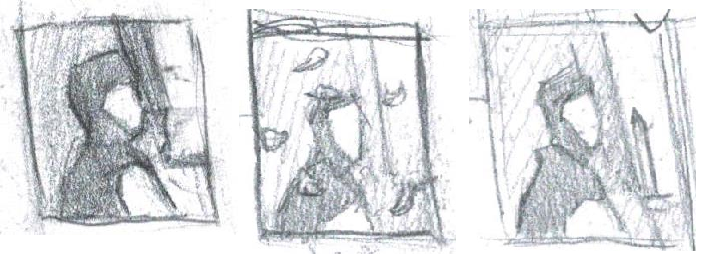

Preparatory Drawings
I completed a number of drawings from life to utilize as references while painting the clothing, architecture and bag strap on her shoulder.


I visited the Egyptian Temple of Dendur at the Metropolitan Museum of Art to make this study. I gained more clarity about details such as chips and the structure of the building elements by drawing the temple from life. Also, this drawing study gave me a sense of how subdued the contrast appears on the hieroglyphs in life.
References
I referenced master paintings to inform ways to describe the texture and form of objects. A few of the paintings I referenced are shown below.


The background in Alma Tadema's The Colesium was referenced in painting the sky.

Drawing on Canvas


Blocking - In the Hieroglyphs


I painted the larger planes of shadow and upturned areas on the hieroglyphs somewhat loosely to suggest a texture for the wall. I kept this layer on average a bit darker than the final value I intended for the wall. I did this because I would be adding another layer on top with broken brush strokes that would be brighter in value to suggest texture. The contrast of the darker under layer poking through the broken brush strokes in the next layer would create an appearance of a rougher surface. I used this technique in painting textures of all the objects in the background, including the wall, sky, clothing and satchel strap. In the sky the lighter layer was used to suggest a softer atmosphere.
Revisions
After a layer for the entire painting was in place I set the piece aside for a while. Returning to the canvas I applied a layer of retouch varnish over the painting to bring back areas that had lost their gloss during the drying process. Paint often dulls in value after oils that are on top of the surface while the paint is wet are later absorbed into the canvas while drying. This layer of retouch varnish or oil restores the value and color to how it was initially painted and would return to in a final varnish. I primarily used oil during the painting process to restore the color of areas that I would be working on top of or next to. The mixture I used consisted of a ratio of 2 parts Odorless Mineral Spirits and 1 part Walnut Oil, which produces quite a clear medium.
With the actual color of the piece restored I then evaluated areas that stood out for me to adjust and made notes on reasons for making changes. I proceeded to address these concerns one by one while revising the painting. I would use Oleogel as a medium to slightly thin out paint while making revisions
Below are a few close up images of the painting with the added layer of texture and revisions.


More posts on the process behind my paintings will be shared soon.