Saturday, December 21, 2013

The Wire Mesh


A hand drawn wire mesh overlaying a photo of my drawing
Recently I have been learning about the importance of the idea of the wire mesh at The Cambridge Street Studios.  Footnotes are included in this post to indicate which sentences in this post are summarizations of ideas that the instructors at The Cambridge Street Studios have explained to me.

The idea of the wire mesh develops the basis of the mindset for modeling form.  Although the wire mesh is most commonly known for its use in 3-D modeling software, the idea of the wire mesh is just as applicable to modeling form in any medium.  While the modeling process is focused on sculpting the form in one's drawing to mimic the three dimensional structure of the forms one is copying, the application of the idea of the wire mesh to that sculptural thought process can help one to specify the structure of the forms one is copying.  The wire mesh allows for much of the specificity about the structure of a form to become apparent.

Wire mesh sketches of the model's mouth and chin from three angles from memory
By investigating the structure of a form from many angles one can better decipher how to sculpt the form in one's drawing.¹  I often make wire mesh sketches of the forms that I have been working on during and away from time with the model.  These sketches help to clarify the structure of the forms that I model.  The additional clarity gained from these sketches helps me to better define that structure in my drawing.

Adding Light Logic To The Idea Of The Wire Mesh


The planes on a form have a specific relationship to the light source based on where they are pointing in relation to the center of the light source.  The diagram above shows how the more a plane faces the light the lighter it becomes in value.  Taking this logic to my wire mesh studies has helped me to investigate the orientation of each plane to the light source.


Jeremy Deck recommends that I often make a wire mesh drawing of the planes on a form that I am about to model before modeling a new form.¹  Although the study above was made from one viewpoint, Jeremy Deck also recommends making planar studies of a form while standing in front of the horizontal center of each form to more clearly see the structure of a form.¹  I make tiny directional arrows projecting from these planes to clarify where the planes are facing.¹  When I place these studies next to my drawing before I am about to model a form I can better understand the structure of the form and the form's orientation to the light source.¹  This type of investigation helps in making the modeling process go faster because it reveals information about what I have to  represent before I even attempt to draw it.

Hand drawn wire mesh path overlaying a photo of my drawing

Additionally, it is helpful to base the directional path that I evaluate a form with on a directional path from the idea of the wire mesh.¹  Although I have found it crucial to evaluate a form in every possible path.  Thinking about the wire mesh really helps me to evaluate the form in my drawing to see if it correlates to the structure of a wire mesh on the model.¹  Essentially, the idea of the wire mesh becomes a tool for comparing the structure of the forms in one's drawing to the structure of the forms on the model.  This comparison is important because, the gradations in one's drawing reveal the specific structure of form that the wire mesh describes.

The idea of the wire mesh was very helpful to me while working on the drawing shown below.


Footnotes
¹ Jeremy Deck, personal communication, 2013.

Saturday, November 23, 2013

Investigating The Position Of High Form Lights

My instructors at The Cambridge Street Studios explained to me, a process for identifying the high form light on a form by reverse engineering from the relationship of a highlight to the light source.  Footnotes are included in this post to indicate which sentences in this post are summarizations of ideas that the instructors at The Cambridge Street Studios have explained to me.

While it can be easy to identify the position of a highlight, because of its value contrast to the surrounding form, it can be difficult to determine the position of the highest form light on a form.
It is crucial to identify the high form light on a form.  All forms have one point that is faced most towards the angle of the light source, that point is the high form light, and all of the remaining planes on a form receive less light as they recede in space from the high form light.  It is only by representing this effect of light on form that one can clearly show a form's spatial orientation to a light source.

Even though high form lights may not appear to be as obvious as highlights, one can reverse engineer from the light source's position in relation to a viewer to determine the position of a high form light in relation to a highlight.¹  To do this, something must be known about highlights and high form lights.


Highlights on a form are visible halfway between the angle of light projected by a light source in single path known as a light ray, and the angle of that light ray's reflection into a viewer's eye.  High form lights are the point on a form that is most parallel to the angle of a light source.  Note, in this post I will use the term highlight to refer to the concentrated area of specular reflection on a form that is seen by a viewer.

Description of Highlights

Highlights are caused by specular reflection and highlights are essentially made up of specular reflections.  Specular reflection is the mirror-like reflection of light on a smooth glossy surface where the angle of incoming light projected in a single direction from the light source, the angle of incidence, is reflected at the same angle into a viewer's eye, the angle of reflection.  Therefore, the angle of incidence equals the angle of reflection.
 An example of a specular reflection on a sphere.

 Many specular reflections cause the large highlight area on the sphere.

A useful analogy that I thought of to help visualize the effect of specular reflection is to imagine hitting a tennis ball on the ground.


The illustration above shows how the angle that the tennis ball is hit at is the same angle that it is reflected at, similar to how in specular reflection the angle of incidence is always the same angle as the angle of reflection.  This principle holds true no matter what angle the tennis ball is hit at.   If the tennis balls in this analogy were photons of light and the path that each tennis ball followed was a light ray then the specular reflection would occur where the light ray hits the surface of the ground, the halfway point between the angle of incidence and the angle of reflection.

Specular reflection is only visible at the halfway point between the angle of incidence and the angle of reflection into a viewer's eye.  A useful analogy that I thought of to help visualize this effect is to imagine you are standing on a tennis court, across from a giant tennis ball machine.  The tennis ball machine projects millions of tennis balls at one moment.  But, you will only be hit by the tennis balls that are in your line of sight.


The point where the tennis balls in your line of sight hit the ground would be the halfway point between the angle of incidence and the angle of reflection into your eye.  If the tennis ball machine in this analogy was a light source, the tennis balls were photons of light, the path that each tennis ball followed was a light ray and the ground was the surface of a form then the specular reflection would be seen at the point where the tennis balls in your line of sight hit the ground (the halfway point between the angle of incidence and the angle of reflection into your eye).  The blue circles on the ground in the above illustration show the area where the specular reflection would be seen for light ray A and light ray B.  The area between where both of these light rays hit the ground is so close that the blue circles are touching.  The grouping of the two blue areas where specular reflection would be seen by the viewer is the same as how specular reflections group together to show a brighter and larger highlight area.  The viewer in this highlight analogy would be hit by different tennis balls in their line of sight depending on where they were located on the tennis court and the area where those tennis balls hit the ground, the area where a highlight would be seen, would change as the viewer moved.

The same principles that apply to the tennis ball analogy are present while viewing a highlight in real life.  

Viewing Highlights

Because highlights are visible when the angle of incidence equals its angle of reflection into a viewer's eye, the highlight shares the same relationship to the high form light as the relationship of a viewer's position to a light source.¹


By knowing one's position in relation to the center of a light source, one can identify where the high form light is in relation to the center of a highlight.¹  The diagram above shows how the position of the viewer in relation to the light correlates to the position of the high form light in relation to a highlight.  For example, the light is very far to the right of viewer A, so the high form light, outlined in red, is very far to the right of the highlight that viewer A sees.  Also, the light is closer to the left of viewer B, so the high form light is closer to the left of the highlight that viewer B sees.


Additionally, the location of the high form light in relation to a highlight changes vertically with a viewer's relation to a light source.¹  In the diagram above, the light is above and to the right of the viewer, so the high form light, outlined in red, is above and to the right of the highlight.  It should be noted that although the relationship of the highlight to the high form light generally correlates to the relation of the viewer to the light source, that distance can not be pinned down to a measurable distance.  For example, just because a viewer is 5 feet to the left of the light does not mean that the highlight is 5 feet to the left of the high form light.  But the distance of the highlight in relation to the high form light will generally correlate to the distance of the viewer in relation to the light source.


Footnotes
¹ Jeremy Deck, personal communication, 2013.

Sunday, November 17, 2013

A Theory On Representing A Local Color


Although one has to deal with a limited value range while drawing on paper, there are ways to manipulate the medium of graphite to better represent an objects' local color.  My instructor, Jeremy Deck, has recently informed me of a way to represent an object's local color with the limited medium of graphite.  This post is an explanation of my understanding of that process.  Footnotes are included in this post to indicate which sentences in this post are summarizations of ideas that Jeremy Deck has explained to me.

By specifying three modeling factors I have been able to better represent the local color of the forms that I see.  These factors include, the value of the highest form light, the distance of the halftone before the terminator and the value of the shadow.¹

 The example above (on the left), represents a sphere with a white local color under much light.  The high form light has been set at white of the paper, the shadow value has been set at a visual average of the shadow value observed and the small distance of the halftone has been pushed very close to the terminator.  By making the distance of the halftone small and very close to the terminator, the drawing seems to represent a light local color under a lot of light.¹
The example above (on the right), represents a sphere with a slightly grey local color under a decent amount of light.  The high form light has been set at white of the paper and the shadow value is also set at a visual average.  The only difference in the modeling factors between this sphere and the one on the left is that the distance of the halftone before the terminator is slightly larger. According to Jeremy Deck, the smaller the distance of the halftone before the terminator, the more a drawing represents a form with a lighter local color under much light.¹  I imagine, and it would depend on the situation, that the darker a local color to be represented the more the value of the high form light would have to darken from white of the paper.

In conclusion, I am not prescribing a formula for representing the local color of objects, this is only one of many ways to represent the local color of an object in graphite.  Rather, I am just sharing how this process has allowed me to better represent the local color of the objects that I draw.  I would like to know how the science of how the eye percieves light can inform one's process for representing the local color of an object as well.  If anyone is willing to share information on this topic with me please let me know.

*Blog Note- Some of you may have noticed that the information in this post has changed from its original post on 11/17/13.  I have found that my explanation did not follow the laws of physics and had to update it.  I apologize for the incorrect information in the original post.  I am still trying to comprehend how the eye processes light and how that effects the way a local color is perceived.  As well as a better way to represent the local color of the forms I draw.  If anyone would like to share some insight with me please let me know.


Footnotes
¹ Jeremy Deck, personal communication, 2013.

Saturday, November 9, 2013

Determining Distances

     Drawing is guided by an understanding of what it is that one is seeing.  Even though simplifying the vague shapes on a subject into animal shapes is helpful, point to point measurement provides additional clarity to the character of the shapes that one sees.  By gauging the distances on, across and within shapes one can better judge the accuracy of the shapes that one is drawing.  There are five types of point to point measurement that I have been learning about at The Cambridge Street Studios and they include, percentage measurement, internal measurement, contour measurement, directional measurement and triangulation.  Please note that besides triangulation, I have come up with my own terms to classify these processes due to an unawareness of any official terms to describe them.  Footnotes are included in this post to indicate which sentences in this post are summarizations of ideas that the instructors at The Cambridge Street Studios have explained to me.
   
     Percentage measurement proceeds by determining the distances on a shape by simplifying its sections into percentages.¹  I first learned of percentage measurement from my instructor, Jeremy Deck, a few months ago.


     In the image above the right side of the shape has been divided into two percentages.  By seeing more specifically how the two segments of the shape appear I can better judge the accuracy of that shape.
     
     Internal measurement is focused on determining the distances within a shape by moving from point to point within a shape.

     Point to point measurement can be applied to the spaces within a shape as well as the spaces within a mass of shapes.  Although much point to point measurement is done just by scanning one's eyes over the subject and the drawing simultaneously, one can trace these imaginary lines in the air for additional clarity of the point to point measurement.

     Contour measurement proceeds by moving from point to point along the contour of a shape to check the accuracy of the segments of a shape.

     It is helpful to think of contour measurement as moving along the segments of an animal shape to see if the line segments in one's drawing correlate to the character of the animal shape that one sees.  Point to point measurement is just a tool to represent the character of the shapes that one sees, and I have found it very important to only use it as a tool.  It has been crucial for me to verify the findings that point to point measurement show me by checking it to the animal shape(s) that I see.

     Directional measurement proceeds by counting the spaces within a shape along a straight directional path.  

     The example above shows the points where one's eye would stop along the directional path.  Any directional path can be used to check points across a mass of shapes whether it be horizontal, vertical or diagonal.

     Triangulation proceeds by selecting three points on a shape and determining the size of the triangle that the three points produce.

     It is very helpful to think of the triangle produced by triangulation as a slice of pizza because one's relation to the idea of the size of a slice of pizza makes it easier to compare the size of the triangle on one's drawing to the size of the triangle that one sees on the subject.

     All five ways of point to point measurement were very helpful to me while I was drawing the block-in shown below.


Footnotes
¹ Jeremy Deck, personal communication, 2013.

Wednesday, July 3, 2013

Benefits of Starting Block-ins Loosely

     My instructor, Jeremy Deck, has recently shown me the benefits to a process of blocking in that is made easier by easing into specificity with a loose start.  I was able to benefit from watching my instructor demonstrate this process many times and discussed the reasonings behind the decisions he was making.  This post is an explanation of the benefits that result from a process of starting a block-in loosely.  Footnotes are included in this post to indicate which sentences in this post are summarizations of ideas that the instructors at The Cambridge Street Studios have explained to me.

     I used to make sure to start my block-ins with lines that were as straight as possible in order to ensure that I was not making my lines curve to the point where I would have difficulty obtaining the character of a shape.  According to Jeremy Deck, once one grasps the idea of the usefulness that straight lines allow for in the clarity of  seeing the character of shapes, a different method can be applied to the start of block-ins that will allow for more accuracy.¹  By beginning a block-in with more attention paid to the character of shapes than the appearance of one's lines one gains greater facility in drawing the shapes that one sees while those shapes are vivid in one's visual memory.  This facility is of great importance because one can only draw from their visual memory.  Since this drawing method requires for one to face their picture while drawing, one can only draw what they remember from what what they have just observed.  Therefore, in order to create the most accurate representation of what one sees requires for one to transcribe that information while it is most vivid in one's visual memory.  Due to the fleeting nature of the visual memory one has to draw as quickly as possible in order to represent what is vivid in one's visual memory.
     It is for this reason that it is very beneficial to start a block-in with a looser manner where more attention is paid to quickly transcribing the character of the shapes that one sees rather than the clean straight appearance of one's lines.  In order to gain the most facility in starting a block-in loosely one must loosely hold their pencil from the very back and draw from the distance of an arms length away from the drawing surface.¹   The same principles of  the block-in process previously described on this blog still apply to this method of starting a block-in.  Meaning that the lines are to be applied with the intent of being straight but if the lines become slightly curved in the process of quickly drawing shapes that is not an issue.¹  The purpose of starting block-ins loosely is  the facility of  putting down the shapes that one sees while they are vivid in one's visual memory.
     Although this method of starting a block-in is useful for any drawing, it is especially useful when drawing the figure because the figure moves.¹  Therefore, the more immediately that one can put down the shapes that one sees on the figure the more accurate the drawing will be.¹  My portrait block-in was started in a loose manner similar to what is shown in the picture below.

     In order to  draw shapes quickly I often don't sharpen my pencil or roll the drawing out with a kneaded eraser because taking the time to do so disrupts my thought process of quickly drawing shapes.¹  If my first attempt is close enough I usually just refine the shapes in another pass right on top of the lighter lines.¹  Or I will quickly strike an eraser through a line and draw right on top of that.  Using a soft pencil such as an HB allows me to draw on top of old lines without fear of scratching the paper.¹  When the lines become too vague due to the use of a dull pencil I must sharpen my pencil in order to gain clarity in the shapes.¹  It is the awareness of the clarity of the shapes learned from practicing block-ins the normal way that allows for one to know whether or not the lines are too vague or not.¹  Before I measure a block-in that has been started loosely I make sure to generally clean out the interior of the shape so that I have a clearer indication of where a shape begins and ends.¹ After a general height to width has been established with the loose lines from the start of the block-in, the drawing  progresses with more attention paid to the straightness of the lines.

This is a portrait block-in that was started loosely and was taken to a conceptual pass.  I could not get as close to the model as I would get to a cast, so I took Tony Ranalli's advice, to use binoculars during the conceptual pass to more clearly see details that were not distinct to me from where I was drawing.²  Another new process that I have been learning about is to not only lighten the shapes that are less distinct but also to make them sketchier in appearence, so to give myself a broader range of the quality and edges of shapes in my block-ins.  This makes it easier to compare the shapes in my block-ins to the vast range of edges that I see in life.¹


Footnotes
¹ Jeremy Deck, personal communication, 2013.
² Anthony Ranalli, personal communication, 2013.

Ear Cast Drawing Process, Part 2

Click image for higher resolution image
The drawing is 9.25" x 6" inches
     I have learned much about modelling form during the process of drawing the ear cast.  This post is a summary of the important aspects of modeling form that I gained insight into from my instructor, Jeremy Deck, at The Cambridge Street Studios.  Footnotes are included in this post to indicate which sentences in this post are summarizations of ideas that Jeremy Deck has explained to me.

     One of the most important things that I have learned is the importance of being deliberate about the decisions that I make while drawing.  Although graphite allows for endless reworking with no loss of a smooth surface quality it is important to be deliberate in the decisions one makes while drawing.  The practice of deliberate drawing allows for the facilitation of the transition from graphite to paint.¹  Because the opaque quality of paint in direct form painting causes the loss of a smooth surface with the addition of multiple layers of paint it is important to be deliberate about one's decisions when painting.  The goal of practicing deliberate decisions in graphite is to develop one's ability to make deliberate decisions while painting.¹  This practice is very important if a smooth finish in the surface of a painting is desired.  And that quality should be desired if the highest resolution of accuracy in a painting is the goal because the final surface of a painting describes the forms depicted within it.  Deliberate decisions in paint not only produce a surface with a high resolution of form but more importantly, deliberate decisions allow for more of a tactile evaluation and realization of form both in graphite and paint.  Towards this end, I try to be as deliberate as possible about making sure that each micro-plane I draw is accurate so that I will have little reworking to do.  Of course I still  have to rework a lot but I have found that the more I practice deliberate drawing the less reworking I have to do when I start a new strip of form.
     Also while drawing the ear cast I learned the importance of the planarization stage of modelling. By skipping the gradation stage of modelling a strip and going straight to the planarization stage one can gain a more accurate representation of the forms that one sees.¹  It was important for me to practice the gradation step at the beginning of my cast drawing so that I could develop the skill of seeing past the values of shapes and see that the values of the shapes are rolling towards and away from a light source.  But once I understood that concept it became more beneficial to start modelling a strip of form with planarization.¹  I noticed that by focusing on the planes at first I was able to more accurately resolve the shape of the planes and their position in relation to a light source.¹  I realized that the more accurately that I draw the planes of a form before marbling the less reworking I had to do.¹  The same process of laying in a strip with lines that run at a perpendicular angle to the most amount of change of light on form that was used during the gradation stage is also used in the planarization stage with this process.¹
     I was surprised by how much I learned about modelling while drawing the wall.  Although the wall seemed flat at first I realized that it contained many subtle rolls.  And I developed greater specificity in marbling form by modelling the wall.  One process that really helped with modelling the large planes of the wall that were barely turning was to include the details soon after I started to marble a form.¹  Below are photos of my drawing of the wall before and after I included the details.
Before
After

 I found it much easier to marble between smaller areas of details than to try to marble large planes of form.  Rolling in and out of the small details allowed me to get a more tactile sense of the form.  Once that tactile believability was created it was much easier to connect the larger form to what I had already marbled.
     Another effect that I had to deal with while drawing the wall was penumbra.   The diagram below is a visual example of the concept of penumbra.

Light comes from all directions in the light source but only certain light rays travel at an angle to touch the sides of an object.  Umbra is caused by the light rays that extend to touch the object and create an area of shadow that is completely occluded from the light source.  Penumbra is caused by the light rays that extend to touch the object and create an area that is partially occluded from the light source.  The less an area of penumbra is occluded from the light source the lighter it is.  My instructor, Jeremy Deck, showed me how to make a diagram that represents the effect of penumbra.

 This 3-D diagram of penumbra that has been divided into quarters may provide an easier way to see the concept of the penumbra becoming lighter as it is more exposed to the light source.  The area of penumbra closest to the umbra is quite dark because it is very much occluded from the light source by the cube above it, while the furthest out area of penumbra is very light in value because it is exposed to much of the light source.
Having an understanding of the concepts that create shadows allowed for me to have a clearer understanding of what I was drawing while I was drawing  the area of penumbra and shadow on the wall.  Although the penumbra looks soft in life it is actually composed of many specific areas of shadow. So I approached the drawing of the penumbra by conceptually organizing my gradations in the penumbra to their respective values.  With this type of specification in thought I was able to more accurately evaluate the subtle gradations within the penumbra.

     Also, the wall offered me my first opportunity to deal with fall off in value.  Although the ear cast is small there was a slight amount of fall of in value on the wall in relation to the ear because the wall was far enough away from light that was focused on the center of the ear.

By placing a flat piece of paper next to my cast I was able to discern just how much the fall off in value was.¹  Due to this effect I had to be careful to only compare the planes on the wall to itself and not anything inside of the ear.
     The only other new phenomenon that I learned about while drawing the ear cast was inter-diffuse reflection.  It was amazing to see that because the hollow spot in the ear is placed directly behind a form that is facing the light the diffuse reflection bounces back and forth between the two surfaces to reflect so many photons of light that the hollow spot in the ear cast becomes brighter than any highlight on the ear cast.
     I definitely learned a lot from this cast drawing and am excited work on my next cast drawing.  


Footnotes
¹ Jeremy Deck, personal communication, 2013.

Wednesday, February 6, 2013

Wintergreen Oil Transfer

I have found a new method of transferring drawings to canvas besides the oil transfer.  Jeremy Deck showed me how to do a wintergreen oil transfer.  Footnotes are included in this post to indicate which sentences in this post are summarizations of ideas that Jeremy Deck explained to me.

A wintergreen oil transfer begins by photocopying  the drawing in reverse.  Then one applies two sheets of foam core up and inside of the stretcher bars to brace the canvas when it will be pressed on during the transfer.¹  The canvas must be places above the ground and should be supported by something in the center.¹  The photocopy is then placed face down on the canvas with a bit of a border and the edges of the photocopy are taped down so it will not move.¹  Then wintergreen oil is quickly applied with a bristle brush.¹  Since too much wintergreen oil results in the transfer to become smeared and too little results in a weak transfer the idea is to scrub the wintergreen oil onto the photocopy so it is not too much.¹  Then paper towels are applied to the back of the photocopy for about 30-50 seconds to absorb excess oil.¹  Then the copy is scraped from the top to the bottom with the edge of a spoon.¹  Pressure is to be applied to  areas of the photocopy in multiple passes and one is to do the same from the opposite side as well.¹  The photocopy can be removed and the transfer is permanently fixed to the canvas and turpentine has no effect on it.¹  This is very useful if one does not want to lose all of the subtle tilts found during the final pass of a block-in.¹


Footnotes
¹ Jeremy Deck, personal communication, 2012.

Composition studies


I have been making some studies of compositions that I like and trying to create a similar composition myself.  I trace the composition and divide it into quarters to see how things are specifically placed.  I have been finding this helpful in finding ways to more subtly compose the alignments of large rhythms in my compositions. Above are examples of such studies.  The left is of a Bronzino and the right is my attempt at a similar composition.

Ear Cast Drawing Process, Part 1

This post is a summary of the process of modelling form in graphite that I have learned at The Cambridge St. Studios.  Footnotes are included in this post to indicate which sentences in this post are summarizations of ideas that the instructors at The Cambridge Street Studios have explained to me.

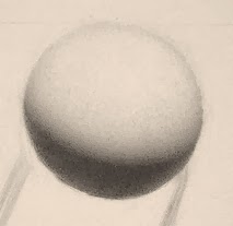
Modeling form is based upon an understanding of an object's relationship to a light source. Every form is spherical and has a specific relationship to a light source(s).

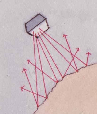
The majority of forms that one sees exhibit diffuse reflection.  Diffuse reflection occurs when light rays projected from a light source reflect at various angles from its meeting with the surface of form due to irregularities in the microscopic surface of a form.
 The example above show only a fraction of the portion of light rays emitted from a light source.  In diffuse reflection, millions of light rays, composed of photons, are projected from the light source to meet the surface of a form and then reflect at various angles.


Consequently, as the light rays from the light source have further to travel before meeting the surface of a form the less light is received by those areas on a form.  This is due to the fact that light rays are composed of photons, which posses more light energy the closer they are to the light source.  The areas on a form that are most facing the light source will reflect many light rays because many light rays can reach those areas that are facing the light source.  As the parts of a form recede from the angle of the light source, they become darker in value due to the fact that they are receiving less light to reflect diffusely.  It is this diffusely reflected light, created by the interaction of light on form, that enters the eye to make an image of the objects that one sees.


The illustration above shows in a constricted sense, if only 7 photons were projecting from the light source, more light rays would strike plane A than plane B, because plane A is more facing the angle of the light source.  Since plane B is facing more away from the angle of the light source it receives less photons, and therefore less light, to reflect diffusely which causes plane B to appear darker in value.

 More Information About Light On Form


 The terminator exists at the apex of where light rays from the light source do not reach. Therefore the terminator defines the area of object that is in shadow.
 
 On the sphere the eye does not perceive the halftone to exist in the middle of a gradation as it often is drawn in most how to draw books.  In  fact under a spot light scenario the eye perceives halftone to start very close to the terminator.  Usually under a spot light scenario the halftone begins at 18 degrees away from the terminator, but situations can vary so much that one would have to determine how close the halftone is to the terminator just by observing it.  To my knowledge, the half tone in a spot light scenario actually occurs at 30 degrees from the terminator but I am not sure why it is usually perceived at 18 degrees before the terminator.  Nevertheless, this knowledge that the eye perceives halftone to exist very close to the terminator allows for a more accurate representation of the forms one is modelling.

 With an understanding of diffuse reflection, the fact that half tone exists very close to the terminator and an acuteness to each forms relationship to the light source one can begin to model form.

     But before the actual modelling of form begins upon a block-in, I made a poster study of the values to be used while modelling.  To explain the modelling process I will use the cast drawing that I am currently working on as an example.
Above is the poster study that my instructor Jeremy Deck made as an example of  a poster study.  The infinite value range seen in life is due to the fact that forms are not vertical.  They can get lighter by facing more towards the light or turning more away from the light.  Because there is a limit to the value range that can exist on the vertical surface of a piece of paper one must approach modelling with the understanding that the value range in their drawing will be compressed as well.  To this end, one can make the value range darker or lighter but it will remain compressed because the paper that one draws on is vertical.  So the poster study is made to represent five key values.  The first value that is determined the cast shadow value on a black surface so that one can know the etxtremities of how dark one's value range could possibly go.¹  An HB pencil was used to make this value and this value set the standard of the value range to be used in the drawing. The next values that were decided upon were the darkest value of the wall shadow, the average value of the cast shadow on the cast, the value of the highest form light and the value of the highlight(which is the white of the paper).¹  The values after the value of the shadow of a black object were decided upon by their relationship to one another (not by copying perceived values on the cast).¹  A line was erased from the value of the highest form light to decide if the value was dark enough for the erased line to read as a highlight.¹
     One should know that due to the fact that the highlight has a major difference in tone in relation to the highest form light, choosing to make the highlight as evident as it appears in life causes the value of the highest form light to be quite dark and therefore causes the entire drawing to darken in compression.¹  This produces a darker drawing that will accurately show the distinction between the highlight and the form light but since the drawing as a whole will be darker the drawing will not appear to represent a white object under a spotlight.  This darkening can be avoided by setting the value of the highest form light to the white of the paper and sacrificing the clarity of the highlight next to the highest form light.¹  I chose to preserve the distinction of the highlight next to the highest form light in this drawing.

     One may wonder why an HB pencil would be the softest pencil to be used in a drawing of a white cast that does not encompass the entire value range.  The reason is because cast drawing is also practice for painting.  And with paint, one's value range is still limited because of working on a vertical plane and if one wanted to paint a subject that had more than one local color they would need skill at modelling form within a limited value range in order to not exhaust one's entire value range on an object of one local color and thus not leaving enough of the range left for objects of darker or lighter local colors.¹

 Using the poster study as a guide for the value of the average cast shadow I began to fill in the shadow areas of the drawing with that value.  It is necessary to flatten the entire shadow area with this value because when one is modelling form it is helpful to have a common value that one is modelling all of the forms out of.  If I was to draw all of the difference in the shadow at first I would have a more difficult time understanding what the value of the darkest form light is supposed to be.  Not to mention the fact that if I finished the shadow first without referring to the values that are in the light part of the form I would more than likely exaggerate the value of the reflected light.
    Flattening proceeds by filling in small squares (about 1/8th of an inch wide) first with a slightly dulled pencil.¹  One is to initially fill in squares from one side to the other to the value desired.¹  This is not a type of drawing that is to be worked up in veils and is to be very direct even when modelling areas of a form that are not in shadow.¹  The evenness of this first application is a result of the right amount of pressure combined with the right amount of speed up and down while moving to the other side.¹  After the initial application there usually are many tiny dots that need to be filled in if the square is to read as completely flat.  To fill it in one is to use a slightly sharper pencil and to pull out darker dots one is to use a blunted dirty kneaded eraser so as not to remove too much graphite that would create more dots to fill in.¹  The slightly sharper pencil is not to poke into the lighter dots as it is to do more the job of gently pushing the graphite from the tip of the pencil into the lighter dots to fill them in.¹  It is useful to view these squares at an angle to notice obvious dots.¹  It is also useful to throw one's eyes out of focus to notice obvious dots.¹  The squares of value are placed next to each other to stay connected.¹  Practice and experimentation with different hardness of lead and different speeds of application is the only way to improve at this.  For this, I used an H pencil.

The pencil is to be sharpened then slightly dulled by rubbing it on the paper as seen in the image above because one does not want to damage the paper.¹  I am working on Artistico Fabriano Extra White, 140 lb. Hot Press paper and too much pressure can really damage this paper.  This was something that I had to be very careful of while making the block-in for this drawing.  It is very useful to have a really sharp pencil before dulling it down a bit.  I use an Eagle 17 lead pointer to sharpen my pencil and it creates a very sharp point.  Eagle 17 lead pointers can be purchased on ebay.

While flattening the shadows and even while modelling the lights the pencil is to be held at about a 45 degree angle from the paper as seen in the image above.¹  A visual example of this application of graphite can be seen in this video of students working at GCA here.

One can go right over any lines that define important information in the shadows without any fear of losing the block-in because the lines show though.  Below is my flattened drawing near the before modelling form.I really only had to flatten around the area that I would be modelling first so I didn't flatten all of the shadows.  After this stage I lightened the outlines from the block-in that were around the area that I was going to model so I get a better idea of what the form actually looks like.¹

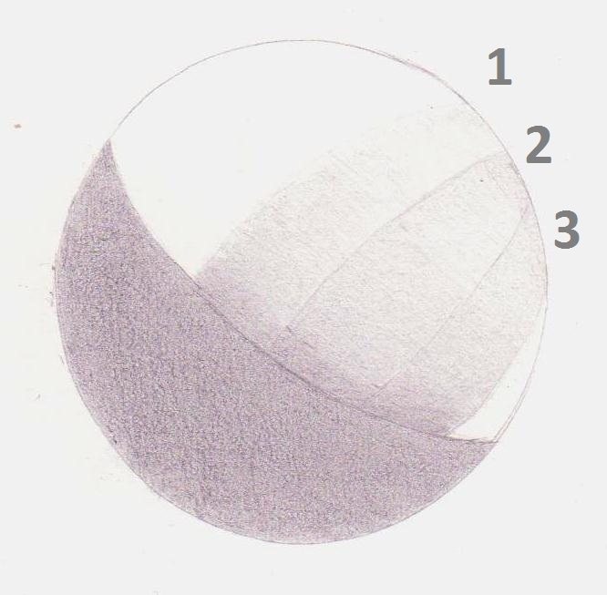
Now I should explain the three step modelling process that I am practicing on this cast drawing.
Step 1 is Gradation.  This is just rolling from the darkest form light to the form light most facing the light source with an understanding that the darkest form light exists just outside of the average shadow value and therefore must be just barely lighter than the average shadow value.¹  Gradations in this method are not decided upon by questioning if something is lighter or darker but questioning whether forms are faced more or less towards the light. And if a form needs to turn away that means it needs to get darker, if a form needs to turn more towards the light that means it needs to get lighter.  The mindset for this drawing method is just as if one is sculpting the form on their drawing to accurately mimic the sculptural form(s) on a cast.  Please note that all the modelling is to be done in small strips that describe the cross contour of a form.¹  In the gradation stage the strip is to laid in with strokes that run at a perpendicular angle to the direction of the largest amount of change in light on a form.¹  For example, in my diagram the sphere is lit from above, so the greatest amount of change in light on form is from top to bottom.  Therefore, I laid strip number 1 with strokes that ran from left to right.  It is much easier to address the holes that occur in the gradation stage when one will be marbling through them instead of against them.¹

Step 2 is Planarization or the grouping of planes.  In this step one is to break the gradation into three to four distinct planes.¹  I now must say that in this drawing method each dot of graphite is not to be referred to as a value alone.  Instead, in this drawing method each dot of graphite represents a micro-plane that has a specific relationship to the light.  So when one is planarizing the goal of cleaning up the planes is to group each micro-plane into its respective larger plane instead of thinking of filling in or taking out dark or light spots in a value.  At the completion of this stage the strip is to look like a planar version of the form.  In my diagram I did not include the terminator value and reflected  light in this step but usually those are added during this step.
 The terminator value is found by referring back to the poster study and determining the value relationship between the darkest part of the wall shadow and the darkest terminator value.¹

Step 3 is Marbling.  The transition from the planarization stage to the marble stage is focused on softening the harsh planar breaks, only as needed, in order to more specifically address the subtle changes in the form that one sees.¹  In this step one gains a tactile sense of the form by imagining the point of their pencil on a specific place of their drawing, looking to the same specific place on the cast and running one's eye(that is on the cast) at the same pace and direction that the pencil is moving on the drawing across a form(s) while one shifts their gaze from the cast to the drawing in order to determine whether some of the micro-planes in one's drawing need to turn more or less away from the light.¹  It is usually best to start at a definite point such as the terminator or the high form light because the only variable is for form to turn towards or away from the light from those definite points.
      If this practice is specifically adhered to then one can gain the sensation of being on the form while they are marbling.  The more that one marbles the more polished the form becomes.  Or rather, the more specific the micro-planes adhere to their relationship to the light source.  One is to begin marbling a strip by marbling along a path that describes the gradation of form with the most change.  Once the major change of a strip has been accurately addressed one can marble the strip in every direction in order to address each micro-plane.¹  After this, one is to address each and every micro-planes relationship to the light source within that strip.¹  Once the overall form of the strip is accurately represented, one can and should include all detail including all the bumps and dents seen on the cast.¹
 
     After a strip has been completed a new strip is added next to it that goes through the three step modelling process and is restitched into the previous strip during the marbling stage.¹  Please note, that for all of the strips besides the first strip one should start by including the terminator value before running a gradation.  One should continue to marble the combined strips of each form as the drawing progresses.    While it is good to keep strips of form next to each other for each form, with every new form one should begin with a strip that describes the most amount of change in the light on that form in order to better perceive the value range for that form.¹  It is very useful to compare back to the planes from the first form while adding new forms, in order to develop an overall relationship hierarchy in one's drawing.
 
      There is not a specific way of looking at one's drawing during this process.  One should squint, throw their eyes out of focus, use a black mirror (a piece of mirror glass that is painted black on the back so as to darken the reflection that one sees.  This is about the same as squinting but much clearer.) and use conceptual ideas about form in relation to light.¹  All of these ways of seeing are tools that one should use to check one's drawing.  If any inconsistencies are found in your drawing while checking it with those tools then the drawing is not accurate.  One should use these viewing tools with an understanding that the value range in the drawing will be much more compressed than what one sees in life so therefore any value observations are to be determined by relationship of one to another.¹  This is very important when drawing shadows because since they are so dark I usually resort more to my black mirror than marbling while drawing them.  But one can think of the form in shadows related to a light source by determining the specific light source for reflected light.  Using a black piece of tinfoil to block out that are to see when the reflected light vanishes is very helpful.¹
I started with these few strips because these strips describe an area of the cast that contains the majority of my value range and it is useful to base any strips added next to them on that value range.  One is to start by taking only a few strips up to the marbling stage and then include the terminator value and reflected light.¹  Or one could flatten the shadow value in relation to the terminator value and put the reflected light in last if one is afraid of making the reflected light too light at first.  Please note, that after the terminator value has been put in the strip has to be re marbled and the dark form light has to re turn into the terminator which makes it darker.¹  This is fine because the average shadow value is just general and it is fine if the darkest form light ends up being darker than the average shadow value.
    The only other thing to consider is the difference in the quality of edges.  This is done mainly by relating all of the edges to the hardest edge.

Below is my cast drawing in progress from last Friday.  I was still marbling the lights and flattening the shadow.  I have been using an H pencil for the gradation stage and a 3H to marble.  So far the darkest pencil that I have used in the shadow has been an HB. The hardness of pencil to use is determined by deciding which lead will produce the values that I desire without the use of so much force that I would scratch the paper.¹

It is very useful to surround the area that one is modelling with a dark value in order to better see subtle gradations.  This is because the eye splits up gradations into 1,000 sections based upon the range of values that it sees.¹  By compressing the range of values that the eye sees by surrounding a drawing with a dark border one can better see the subtle gradations in what they are drawing.¹  It is very useful to wear a hat with a brim while modelling to get rid of the reflected light that the planes facing the light on the texture of the paper are receiving so that one can better see the subtle gradations in what they are drawing.¹

Below are some tactile evaluation analogies that have been helpful to me while I was in the marble stage of this drawing.
 Rain on Tiles-  Imagining the rays of light as rain that is falling onto a form.  When tiles on a roof are faced most towards the rain it makes a really loud noise and when the tiles are facing less parallel to the rain a gentler sound is heard.
The Ant-  The ant is pretty much the same as the marble but by imagining the point of the pencil as an ant crawling on the form that is seen one can imagine how much energy the ant has to exert while crawling on a form.  This helps to make subtle rolls easier to see.
The Skateboard- The skateboard analogy was conceived by Tony Ranalli.  The skateboard is pretty much the same as the ant but is imagining skateboarding across a form while modelling instead of an ant crawling.²
Any analogies that one can relate to are helpful to refer to while modelling form.  And another useful tactile evaluation tool is to touch the forms on the cast that one is modelling.  Touching the cast can be of great use to more accurately interpret the gradations that one sees on the cast.


Footnotes
¹ Jeremy Deck, personal communication, 2012.
² Anthony Ranalli, personal communication, 2012.


Drawing At The Picture Plane


This post is a summary of the comparative measurement block-in process that I have learned from Jeremy Deck at The Cambridge St. Studios.  Footnotes are included in this post to indicate which sentences in this post are summarizations of ideas that the instructors at The Cambridge Street Studios have explained to me.

The Importance of Practicing Block-ins
The Block-in describes the outlines of an image that an artist defines before modeling a subject.  The block-in is the foundation for modeling form.  One cannot achieve maximum accuracy of form without a completely accurate block-in.  The more accurate of a map that one can layout to model on top of the more accurate the modeling can be.  If complete accuracy is not adhered to in the block-in the planes that the shapes in the block-in describe will be off and therefore the modeling on top of that block-in will not be accurate. 
The practice of blocking in with an emphasis on copying the shapes that one sees is very important.  It is by copying the character of the shapes that one sees that allows one to gain the highest accuracy in a block-in.  It is no wonder that in the 19th century, with the invention of photography that the accuracy in drawing improved tremendously. ¹  It is not that artists were necessarily using photography (although some artists did trace from photos) but the invention of photography allowed for artists to see that specificity to the shapes that one sees allowed for a higher level of accuracy.¹   It was thought by artists prior to the 19th century that a profound knowledge of anatomy would imbue their drawings with complete accuracy.  But the copying of anatomy without building the anatomy upon accurate representations of the shapes that one sees does not result in accurate drawing.  When only the general  idea of what accurate anatomy  looks like is applied to a block-in the proportions that one is drawing become general as well and the practice of blocking-in with that mindset will not result in the specific proportions of the subject that one is copying.  Take for example this drawing by Michelangelo.  

 It is completely accurate in the general idea of anatomy but no one looks like that.  If one was to follow Michelangelo’s mode of thought one could perfectly draw the general anatomical idea of a bicep and not draw a specific bicep seen in perspective on a specific individual.  Paying attention to the visual shapes that anatomy conforms to on each individual seen in perspective helps to avoid this fault.  Take these drawings by Bouguereau as an example of the specific accuracy that focusing on the shapes that one is copying allows for.  


 Notice how accurate anatomy must conform to the shapes that one sees in order for a drawing to represent a specific subject.
To ensure the most accuracy in copying the shapes that one sees it is useful to use comparative measurement.  The practice of comparative measurement allows one to ensure that all of the shapes are accurate in relation to a specific height to width measurement.¹  Without the use of comparative measurement and only the practice of trying to copy the shapes that one sees through plumbing the height to width relationship usually becomes in accurate.¹  To practice comparative measurement there are specific guidelines that must be adhered to.

 The Set- Up (please note that actual perspective was not used in creating this diagram)

What one sees is limited to what is in one's cone of vision.  A cone of vision describes the extremities of one's sight.  The cone of vision spreads out equally in each direction the further it moves away from one's eye and is always parallel to one's gaze.  In the diagram above the orange figure is drawing the box on the wall and the yellow lines represent his cone of vision, the blue figure is making a horizontal measurement of the box on the wall and the green lines represent his cone of vision. The easel must be set-up at a perpendicular angle to the subject so that the horizontal center of the subject is at the center of one’s cone of vision.¹  This way one can easily look from their drawing to the subject without having to arch their neck or move their feet.¹  In this diagram the drawing board is placed parallel to the orange figure’s cone of vision.  If the center of one’s cone of vision is not on the center of the drawing then the drawing could appear correct from the angle that they are drawing at but when properly viewed by a viewer who is parallel to the picture the proportions will look distorted.¹  This diagram also demonstrates that the angle that measurements are made at must be parallel to the angle of one's cone of vision.  If the stick that the blue figure in this diagram is holding was placed at a non-parallel angle to his cone of vision, the accuracy of his measurement will be slighted by the distortion of the angle that he is measuring on.  Also note how close the orange figure is to the subject that he is drawing.  It is advisable to get as close as possible, without distortion, when drawing because the closer one is the crisper things look and it is easiest to draw something when one can see it as clearly as possible.¹

Taping off the cast

This diagram illustrates what taping a vertical and horizontal extremity that one sees of a cast does for the placement of the cone of vision.  By taping off the horizontal and vertical extremities from the angle that one sees a cast the cone of vision becomes cemented in a specific place.¹  In this diagram the eye can look in any direction up, down and left to right but the eye’s position horizontally and vertically must be fixed if one wants to ensure that they are copying the same image each drawing session.  By taping off one’s toes one ensures that the distance of the eye from the cast remains constant.¹   Please note that taping off the horizontal and vertical extremities is usually only applied to cast drawing.  Although one could tape off where they see the vertical and horizontal extremities on a figure, a figure moves.   But it is useful to tape off one’s feet when drawing a figure.¹

Measuring (please note that actual perspective was not used in creating this diagram)

 The goal of the block-in is to accurately represent the subject they are drawing as it appears on the picture plane.¹  The picture plane can be thought of as an imaginary piece of glass that one views a subject through.  The viewer in the illustration above has to look up and down to see the entire box they are measuring.  Since the viewer has to look up and down to see the entire box in the illustration above, the overall picture plane that contains the entire image of the large box is as curved as the arc of the viewer's eye that has to look up and down to view the entire box on the wall.¹  This is why one must make sure that the measurements for each section of their cone of vision are parallel to each section of the picture plane in order to make accurate measurements.¹
     Measuring at an arm’s length helps to ensure that the distance of the picture plane that one is measuring on remains at a fixed distance from the eye.¹  It is helpful to think of the picture plane that one measures on as a sheet of glass and the block-in just as a representation of the shapes that one sees on that sheet of glass.¹  To this effect when one gets to the point where they are adding up spaces between the lines in their drawing it is helpful to think of it as tapping on the glass of the picture plane instead of just pointing in the air.¹  It is difficult to make sure that one is measuring at a completely parallel angle to their cone of vision but there is a useful trick to making this task easier.  According to Andrew McManus, the measuring tool will only appear parallel to one's cone of vision when it reaches its longest length in perspective.²


The example above shows how the size of the measuring tool diminishes in perspective as it is turned towards and away from one's eye, even when it is held from the same point.  When the measuring tool is longest in perspective, as seen in the middle image above, it is parallel to one's cone of vision.


Keeping the measuring tool parallel to one's eye in perspective also applies to horizontal measurements as well.  This is illustrated in the images above.

Here is a demonstration of the practice of comparative measurement on a Bargue copy.
Block-in Step 1-The Envelope

The first step starts with measuring the actual size of the longest dimension of the Bargue.  It is easiest to copy shapes when working at actual or sight size.  So I made the length of my copy the same length as the Bargue.  Then I used a level to mark off the top and bottom of my copy with horizontal lines. A level was also used to make the vertical line. In comparative measurement the longest dimension on the drawing remains fixed and it is the goal of comparative measurement to find the measurement of the shorter dimension on the drawing.  
     After this, the next step is the envelope.  Using a hard sharp pencil (I usually use and H) and thick lines, made from multiple applications of the pencil to the paper, I drew lines that generally envelop the shape of the ear.  By using thick sharp lines it is easy for me to use my kneaded eraser to change the sides of the lines I make when I realize that they have to be moved.  To keep it simple, it is helpful to use only 3-5 lines for the envelope.¹  The order that I drew these lines in was decided by starting with the lines of the longest dimensions of the ear to get a feel for the overall mass of the shape of the envelope and I then added tilts from there.¹  This same process of laying in shapes from the longest tilts to shorter tilts is followed while laying in all of the shapes throughout the block-in process.¹  It is important to keep the lines straight throughout the entire block-in process to simplify any curves that are seen.¹  The idea is to work from general to specific so using straight lines is very helpful for that.  It is also important to let the lines cross over each other throughout the entire block-in process in order to have an easier time of moving their points of intersection while re-arranging shapes.¹

Block-in Step 2-Large Rhythms

Three lines were drawn that indicate large rhythms that run through entire shape of the cast.  Although measuring will take care of the majority of any placement issues I tried to be as specific about where I placed these marks because I have found that the better I start my block-ins the smoother the process of comparative measurement is.¹  For this stage one can even face the Bargue and draw a line in the air with their pencil to get a better feel of a rhythms placement within the envelope.¹  It is very useful in this stage and the previous stage to simultaneously turn one’s head from the drawing to the Bargue while still drawing to get a better feel for the angles that the tilts are at.¹

Block-in Step 3- Big Shapes

After I lightened my envelope and large rhythms by rolling my kneaded eraser into a ball and rolling it on top of the drawing, I drew the big shapes that I saw in the ear.  To keep it simple, it is helpful to only use 3-6 shapes in this stage.¹  Instead of trying to draw abstract shapes or tilts it is much easier and useful to focus on copying the character of the shapes that one sees.  A great way of seeing the character in shapes is to think of them as the silhouettes of cartoon animals.  It is much easier to get an impression of the character of an animal shape than that of an abstract shape, so I proceed through the entire block-in process with referring to the shapes that I see as animal shapes and try my best to copy the character of them.  By throwing my eyes out of focus (opening them wide enough to the point where things become slightly blurred) I can better see shapes.¹  It is useful to start with the most obvious shape that one sees and I tried my best to place it as accurately as possible within the envelope the I made while using the rhythms as a guide for its placement.¹   

To me this shape was a snake.  To get a better idea of the character of different parts of a shape it is useful to think of a different animal shape(s) that characterizes a specific part of a shape.¹  For example, if I was having trouble imagining the snakes tail I could instead think of that area of the shape as a dogs head looking down.  I used thick lines to get a general sense of where the final thin line will be placed.  One is not supposed to think of the final thin line being placed on a side of this thick line but one is to think of the final thin line eventually to be placed somewhere in the middle of the thick lines.¹  Please note that while putting in the other big shapes it is fine if they do not completely adhere to the shape of the envelope.  The envelope is just a try and since it is usually not 100 percent accurate one must let the animal shapes be a guide.¹  Also, it is much easier to get straight lines when focusing on copying the character of the animal shapes instead of copying tilts.  It is very useful to check the alignment and angles of the animal shapes throughout the block-in process.¹  To make it easier to compare the shapes in my copy to the shapes on the Bargue I made parts of certain shapes that were not as distinct on the Bargue lighter in my copy.

Block-in Step 4- Halfway Alignment

After the big shapes have been put in I have enough information in my block in to refer to while checking my measurements.  In this stage I aligned the shapes to the halfway mark of the longest dimension on my drawing to the halfway mark of the longest dimension on the Bargue.  Awareness of animal shapes is at the core of this measuring process too.¹  Any adjustment to the alignment of shapes to any measured mark must come with keeping the animal shapes in mind.¹  Since there is room for error with measuring, the animal shapes can be a great guide for letting one know if one's measurement may be off.¹  For example, if it seemed like moving an animal shape much further than it could possibly move because one's measurement says so it becomes important to check the measurement multiple times.  
     When drawing a cast one can’t really place their measuring tool on the cast to find the halfway point but one certainly should place their measuring tool on the drawing to ensure that their measuring and aligning is accurate.  To do this properly one has to make sure that they are looking at the extremity of each measurement at eye level.  For instance, when I was finding the halfway mark on my drawing I made sure to look at the top and bottom of the measurement on my knitting needle at eye level to make sure that I had a constant measurement.¹  I have found it more useful to mark a line on my knitting needle when trying to find these measurements instead of using my thumb.  But there is no remedy for this when measuring the cast.  One just has to try their best to keep their extended arm still (even if it means holding one's wrist with their other hand) and make sure that whatever measurement they are referring to goes from the top of their thumbs fingernail to the top of their measuring tool.¹  Because of the inconsistencies in measuring it is necessary to check one’s measurements multiple times while trying to be as precise as possible about them and going with the measurement they find most often.¹  Please note that the colored lines that appear in these photos were not on the Bargue while I was drawing.  I used a knitting needle to measure and check alignments.  And the horizontal line on my drawing that represents the halfway mark was made with a level to ensure its accuracy.

Block-in Step 5- Alignment of Quarters

I now aligned the shapes in my drawing to the quarter marks on the Bargue.  The placement of the initial big shapes that I put in during step 3 were not too far off so I  just used a rolled kneaded eraser to lighten my initial shapes and re placed them.  But in a situation where the initial shapes are found to be very off while checking these measurements it is useful to just roll out the initial shapes with a kneaded eraser, mark off notations of where the shapes now have to be placed and then re draw them.¹
Note that I am still only using the initial shapes that I started with.  This is because much of blocking in is about accuracy of the big shapes.  Only after I have checked the height to width and alignment of the drawing do I have the confidence to add more tilts to those shapes.¹

Block-in Step 6- Flipping a dimension

This is the step prior to checking my height to width measurement.  To get a clue as to which side of my drawing is more off and will most likely have to change to make my height to width work I flip the longest part of the  longest dimension that can be flipped into the shorter dimension.  In this instance, I flipped the halfway measurement instead of the quarter measurement because the halfway is long enough to be flipped for it to cross over when checked from the left and right side on the Bargue.  If I was to flip a quarter, which is not long enough to cross when checked from the left and right side, I could get the quarters to work well in my drawing and not be certain of the space in between them.¹  In this instance, I found that the halfway measurement of the height flipped into the width was much more accurate in my drawing when flipped from the the right side than the left side.  This gave me an idea that the left side of my drawing may have to move to the right so the halfway flipped from the left side can touch where it is supposed to. 

This guess was confirmed when I checked how the width of the Bargue flipped into the height of the Bargue.  I noticed that the width flipped into the height on my drawing was much longer than it was supposed to be.  I flipped the width into the height from the top and bottom of the Bargue but in this photo I am just showing the width flipped from the bottom of the Bargue.

Block-In Step 7- Height to Width

I now moved the left side a bit to the right which made the halfway flipped from that side touch where it was supposed to and shortened the width of my drawing so that the width flipped into the height on my drawing touched where it was supposed to.  Overall, the decision to move a shape should also be based upon seeing it in the animal shapes and in this instance it did seem like the shape of the left earlobe, that I saw as a snake, could move to the right so I changed it.  One can trust the relationship of the shorter dimension flipped into the longer dimension if they have properly aligned the shapes to the halfway and quarter marks in the longer dimension.¹ 

Block-in Step 8- Anchor Plumb

The final step of comparative measurement is what Jeremy Deck calls the "anchor plumb".¹  This stage is to make sure that even after a proper height to width measurement has been defined that the shapes within are properly aligned.¹  To do this one must flip a part of the longest dimension into the shorter dimension and plumb it through the longest dimension.¹  It is useful to use an anchor plumb that runs through a lot of information on what one is copying.¹  In this instance, I flipped a quarter of the longest dimension from the left side of the Bargue.  To see how the shapes related to this plumb on the Bargue I held the point of my knitting needle in between my fingers and let it dangle which allowed gravity to place it completely vertical.¹  On the drawing I just used a level to make sure that it plumbed completely vertical.  I then re-organized my shapes around this plumb line.  After this one can check the alignment of 1/8th’s on the longest dimension and can flip the measurements of the 1’4’s and 1’8’s into the shorter dimension if they want to. 

Step 9- Alignment, Angles, Animals
After the anchor plumb is established one can focus completely on the alignment and angles of the animal shapes without worrying too much about measuring because the measuring previously used should have properly placed key points in the drawing.¹  As long as these key points do not move the block-in can be adjusted without fear of losing accuracy.¹  Please note, that because there is room for error with measuring the animal shapes are the greatest guide at this point because in the end the eye is more accurate than any measuring device.¹  To this end, if the shapes seem to need to move beyond the measured marks a bit it usually is fine as long as they don’t go too far beyond the measured marks.¹  After the anchor plumb stage the broad lines can be broken into smaller tilts, while thinking of adding tilts as adding character to the animal shapes, and using thinner lines to be more specific.¹  The general rule is to work from general to specific.  So the thinness of the line is to correspond to the amount of tilts and shapes that are in the drawing.¹  Also, it is a good idea to make sure that no part of the block-in is advancing too far beyond other parts because it would make it too difficult to compare the different areas that one is working on.¹  (The only exception to this rule is in drawing the figure because it is fine for the drawing of the torso to advance beyond other parts since the torso is the part of a figure that moves the least and the development of other areas should be based around it.)  It can be very helpful to switch to a rubber eraser to thin the line.  The Tombo Mono Zero is a great thin rubber eraser and can be purchased here http://www.jetpens.com/Tombow-Mono-Zero-Eraser-2.3-mm-Circle-Silver-Body/pd/1747  And it can be helpful to lighten a previous attempt by using a rolled kneaded eraser to roll it out and then try again more specifically with the pencil on top of it.  I find it useful to plumb just about everything in this stage before thinning my line too much.
      Also, after the "anchor plumb" stage it is very useful to think of how the animal shapes relate to each other by imagining how the different animal shapes are interacting with each other and checking to see if the same is happening in one’s drawing.¹  Another useful tip is to quickly turn one’s head from a shape on the Bargue to a shape on the drawing to see if it is animating or moving more or less than it is supposed to.¹  When drawing a cast with comparative measurement, although the block-in started at an arms length away from the eye by this step the easel is much closer and by the final pass step the front of the easel is to be touching one's feet so one can have a clear view of what they are drawing.¹  When drawing this close the drawing board must be raised or lowered from its original placement so that what one is drawing is at the center of their cone of vision.


Step 10- Final Pass (Conceptual Thinking)
In this stage one focuses more on the three dimensional reality that the shapes describe.  It is to be thought of as reaching into the picture plane, placing the point of one’s pencil on the form and running it across the side of the form that the shapes describe to discover how much the form is advancing and receding in space.  One should draw the conceptual pass using the lines that were made while discovering the placement of the shapes as a guide.¹  Because it is easy to exaggerate tilts in this stage it is necessary to check the results of the conceptual pass to animal shapes to make sure that one is not exaggerating tilts.  It is still crucial to use straight lined even in this stage.  It is very difficult to decide on the amplitude of each curve when trying to draw it all at once so it becomes useful to break up curves into small straight lines as if the lines were planes in space.¹   The advanced student can apply conceptual thoughts of anatomy and perspective into the conceptual pass at this stage but since I am a beginner I only go as far as thinking about planes advancing and receding in space during the conceptual pass.  It is only when a student has attained a high skill level with measuring and animal shapes that they can move to anatomical thinking during the conceptual pass to ensure that their knowledge of anatomy will properly conform to the visual shapes that one sees.  In the end, knowledge of anatomy is very important, especially for modeling form, and if one does not immerse themselves in the study of anatomy they can reach a limit by only copying shapes.

Below are some block-ins that I have taken to the conceptual pass stage.  Please note, that the light shading of the shadows in these studies was done as a last step.  By shading in the shadows the light shapes appear bigger than they actually are.  So to give me a greater potential for accuracy in blocking-in I shade the drawing in as a last step and it is only to make the block-in easier to look at.  It does nothing to make the block-in more accurate. Also note that for this post and future posts that some of the work that I have made at school have small areas that my instructors have drawn on for demonstration purposes.

Tippy casts are a great way to practice comparative measurement because the shapes become so unfamiliar to a preconceived understanding of anatomy that one has to focus on the character of the shapes before them to attain any accuracy. These block-ins were each worked on for a couple of hours.  Jeremy Deck reccomends practicing comparative measurement on cast drawings at life size .  So when determining the measurement of the longest dimension when beginning a drawing one can actually place a knitting needle on the cast to ensure that the measurement of the longest dimension is life size.¹  Below are some examples of some tippy casts that I have done.


Blocking in the figure uses the same method of comparative measurement that I have described in the Bargue demonstration.  The only difference is that it is very helpful to use the shape of the torso to start because since a figure moves the part of the body that moves the least is the torso.  So it is very helpful to get the torso as accurate as possible first and then move out from there.¹  For example, in this figure Bargue copy the first shape that I drew was the shape of the torso.
Below are some of the figure Bargues that I have done.


These figure Bargues are just for the practice of seeing how close one can get the animal shapes and measurements within a short time frame so all of these figure Bargues (except for the first one) were done between 4 and 4.5 hours.  The timing system that I usually use for these is as follows.
-5min- Envelope and Rythms
-20min- Big Shapes
-20min- Halfway Alignment
-30min- Alignment of Quarters
-30-45min-Height to Width Reorganization
-30min- "Anchor Plumb"
-30min- Alignment of 1/8's
-1hr- Adding tilts

Please note, that because these figure bargues are much too large to be seen in one cone of vision it is useful to place it at a perpendicular angle to one's gaze while copying them.  Jeremy Deck (personal communication, 2012) recommeds propping the Bargue on a few pieces of cardboard.

Comparative measurement can also be practiced in a sketchbook through the use of a measuring stick that one can mark measurements on in place of a knitting needle.  If this measuring stick has edges that are perpendicular then vertical and horizontal plumbs can be obtained by making sure that the top or side of the measuring stick is parallel with the vertical or horizontal extremities.  If the measurement of the longest dimension on the Bargue and on one's copy is the same then the after the block-in is complete its accuracy can be checked on a light box.  Or if one does not have a light box the block-in can be checked by overlapping the Bargue and the copy in Photoshop.


Footnotes
¹ Jeremy Deck, personal communication, 2012.
² Andrew McManus, personal communication, 2013.